۶۵
دیدگاه
نظر

آموزش hover در CSS - افکتهای زیبا hover با CSS
سرفصلهای مقاله
- افکت زیبای هاور انیمیشن دکمه ها
- افکتهای زیبا برای مجموعه ای از دکمه ها
- افکت زیبای هاور سه بعدی نمایش تصاویر
- افکت زیبای هاور برای نمایش پس زمینه ی پنهان
- افکت زیبای هاور انیمیشن - پلههای برج
- افکت زیبای هاور CSS Highlight برای متون inline
- افکت عکس در html
آیا تا کنون هنگام بازدید از یک وب سایت، از افکتهای زیبای هاور آن حیرت زده شده اید؟ یا انیمیشنهای ظریف رابط کاربری (UI) سایت شما را تحت تاثیر قرار داده است؟ ممکن است این گونه به نظر برسد که افکت زیبای هاور، از جمله جزییات کوچک یک سایت باشد؛ اما این افکت و انیمیشنهای شناور آن میتوانند تأثیر بیشتری نسبت به آنچه انتظار دارید بر روی مخاطب داشته باشند. به همین دلیل تصمیم گرفتیم در مقاله ی آموزش hover در CSS به آموزش ساخت چند افکت هاور زیبا بپردازیم. یکی از ویژگیهای طراحی یک رابط کاربری خوب، روشن و قابل مشاهده بودن عناصر تعاملی است. افکتهای شناور میتوانند به شما کمک کنند تا سایت شما زیباتر به نظر برسد و کاربران به سادگی بتوانند با طرح آن تعامل برقرار کنند. هم چنین به یاد داشته باشید هنگامی که کاربران موس خود را بر روی لینکها و دکمههای سایت شما حرکت میدهند، میبایست متوجه تغییراتی شوند که به آنها تفاوت را نشان دهد و شما میتوانید این تغییرات را در قالب افکت هاور به آنها نشان دهید. شما میتوانید با استفاده از CSS و HTML افکتها و انیمیشنهای چشمگیری را ایجاد کنید. اگرچه برای ایجاد انیمیشنهای پیچیده ممکن است به جاوا اسکریپت هم نیاز داشته باشید. در ادامه ی مقاله ی آموزش hover در CSS ، شما را با انواع مختلف افکتهای زیبای هاور آشنا میکنیم. شما میتوانید از این افکتها در طراحی سایت خود استفاده کنید یا از آنها الهام بگیرید.

افکت زیبای هاور انیمیشن دکمه ها
کد این افکت زیبا و مدرن بسیار تمیز و قابل سفارشی سازی میباشد.  کد HTML:
<div class="data-container">
<span class="btn">Hover Me </span>
</div>
کد CSS:
body{
	margin:0;
	padding:0;
}
.btn{
cursor:pointer;
	position:relative;
	padding:10px 20px;
	background:white;
	font-size:28px;
	border-top-right-radius:10px;
	border-bottom-left-radius:10px;
	transition:all 1s;
	&:after,&:before{
		content:" ";
		width:10px;
		height:10px;
		position:absolute;
		border :0px solid #fff;
		transition:all 1s;
		}
	&:after{
		top:-1px;
		left:-1px;
		border-top:5px solid black;
		border-left:5px solid black;
	}
	&:before{
		bottom:-1px;
		right:-1px;
		border-bottom:5px solid black;
		border-right:5px solid black;
	}
	&:hover{
		border-top-right-radius:0px;
	border-bottom-left-radius:0px;
		// background:rgba(0,0,0,.5);
		// color:white;
		&:before,&:after{
			width:100%;
			height:100%;
			// border-color:white;
		}
	}
}
.data-container{
	background:#ffebee;
	height:100vh;
	display:flex;
	justify-content:center;
	align-items:center;
}افکتهای زیبا برای مجموعه ای از دکمه ها
شما میتوانید بنا بر نیاز و سلیقه ی خود از این افکتها در طراحی رابط کاربری سایت به صورت جداگانه یا جمعی استفاده کنید. این افکتها واکنش گرا هستند و در دستگاههای تلفن همراه به خوبی نمایش داده میشوند.  کد HTML:
<section class="buttons">
    <h1>Button Hover Effects</h1>
  <div class="container">
    <a href="https://twitter.com/Dave_Conner" class="btn btn-1">
      <svg>
        <rect x="0" y="0" fill="none" width="100%" height="100%"/>
      </svg>
     Hover
    </a>
    <!--svg hover inspired by https://codepen.io/karimbalaa/pen/qERbBY?editors=110 -->
    <!--End of Button 1 -->
    <a href="https://twitter.com/Dave_Conner" class="btn btn-2">Hover</a>
    <!--End of Button 2 -->
    <a href="https://twitter.com/Dave_Conner" class="btn btn-3">Hover</a>
    <!--End of Button 3 -->
    <a href="https://twitter.com/Dave_Conner" class="btn btn-4"><span>Hover</span></a>
    <!--End of Button 4 -->
    <a href="https://twitter.com/Dave_Conner" class="btn btn-5">Hover</a>
    <!--End of Button 5 -->
      </div>
 </section
کد CSS:
@import url(https://fonts.googleapis.com/css?family=Roboto:400,100,900);
//colors
$red: #E1332D;
$white: #fff;
//base styles
* {
  box-sizing: inherit;
  transition-property: all;
  transition-duration: .6s;
  transition-timing-function: ease;
}
html,
body {
  box-sizing: border-box;
  height: 100%;
  width: 100%;
}
body {
  background: $red;
  font-family: 'Roboto', sans-serif;
  font-weight: 400;
}
// Main wrap
.buttons {
    display: flex;
    flex-direction: column;
    height: 100%;
    justify-content: center;
    text-align: center;
    width: 100%;
}
// Button wrap
.container {
    align-items: center;
    display: flex;
    flex-direction: column;
    justify-content: center;
    padding: 1em;
    text-align: center;
    @media (min-width: 600px) {
        flex-direction: row;
        justify-content: space-between;
    }
}
h1 {
  color: $white;
  font-size: 1.25em;
  font-weight: 900;
  margin: 0 0 2em;
  @media (min-width: 450px) {
    font-size: 1.75em;
  }
  @media (min-width: 760px) {
    font-size: 3.25em;
  }
  @media (min-width: 900px) {
    font-size: 5.25em;
    margin: 0 0 1em;
  }
}
p {
  color: $white;
  font-size: 12px;
  @media(min-width: 600px) {
    left: 50%;
    position: absolute;
    transform: translate(-50%, 0);
    top: 90%;
  }
  @media(max-height: 500px) {
    left: 0;
    position: relative;
    top: 0;
    transform: translate(0, 0);
  }
  a {
    background: rgba($white, 0);
    border-bottom: 1px solid;
    color: $white;
    line-height: 1.4;
    padding: .25em;
    text-decoration: none;
    &:hover {
      background: rgba($white, 1);
      color: $red;
    }
  }
}
//button styles
//default button
.btn {
  color: #fff;
  cursor: pointer;
  // display: block;
  font-size:16px;
  font-weight: 400;
  line-height: 45px;
  margin: 0 0 2em;
  max-width: 160px;
  position: relative;
  text-decoration: none;
  text-transform: uppercase;
  width: 100%;
//   @media(min-width: 400px) {
//     display: inline-block;
//     margin-right: 2.5em;
//     &:nth-of-type(even) {
//       margin-right: 0;
//     }
//   }
  @media(min-width: 600px) {
    margin: 0 1em 2em;
//     &:nth-of-type(even) {
//       margin-right: 2.5em;
//     }
//     &:nth-of-type(5) {
//       margin-right: 0;
//     }
  }
  &:hover { text-decoration: none; }
}
/////////////////////////////////
//button one
///////////////////////////////
.btn-1 {
  background: darken($red, 1.5%);
  font-weight: 100;
  svg {
    height: 45px;
    left: 0;
    position: absolute;
    top: 0;
    width: 100%;
  }
  rect {
    fill: none;
    stroke: #fff;
    stroke-width: 2;
    stroke-dasharray: 422, 0;
    transition: all 0.35s linear;
  }
}
.btn-1:hover {
  background: rgba($red, 0);
  font-weight: 900;
  letter-spacing: 1px;
  rect {
    stroke-width: 5;
    stroke-dasharray: 15, 310;
    stroke-dashoffset: 48;
    transition: all 1.35s cubic-bezier(0.19, 1, 0.22, 1);
  }
}
////////////////////////////
//button two
//////////////////////////
.btn-2 {
    letter-spacing: 0;
}
.btn-2:hover,
.btn-2:active {
  letter-spacing: 5px;
}
.btn-2:after,
.btn-2:before {
  backface-visibility: hidden;
  border: 1px solid rgba(#fff, 0);
  bottom: 0px;
  content: " ";
  display: block;
  margin: 0 auto;
  position: relative;
  transition: all 280ms ease-in-out;
  width: 0;
}
.btn-2:hover:after,
.btn-2:hover:before {
  backface-visibility: hidden;
  border-color: #fff;
  transition: width 350ms ease-in-out;
  width: 70%;
}
.btn-2:hover:before {
  bottom: auto;
  top: 0;
  width: 70%;
}
/////////////////////////////
//button -3
///////////////////////////
.btn-3 {
  background: lighten($red, 3%);
  border: 1px solid darken($red, 4%);
  box-shadow: 0px 2px 0 darken($red, 5%), 2px 4px 6px darken($red, 2%);
  font-weight: 900;
  letter-spacing: 1px;
  transition: all 150ms linear;
}
.btn-3:hover {
  background: darken($red, 1.5%);
  border: 1px solid rgba(#000, .05);
  box-shadow: 1px 1px 2px rgba(#fff, .2);
  color: lighten($red, 18%);
  text-decoration: none;
  text-shadow: -1px -1px 0 darken($red, 9.5%);
  transition: all 250ms linear;
}
/////////////////////////////
//button-4
///////////////////////////
.btn-4 {
  border: 1px solid;
  overflow: hidden;
  position: relative;
  span {
    z-index: 20;
  }
  &:after {
    background: #fff;
    content: "";
    height: 155px;
    left: -75px;
    opacity: .2;
    position: absolute;
    top: -50px;
    transform: rotate(35deg);
    transition: all 550ms cubic-bezier(0.19, 1, 0.22, 1);
    width: 50px;
    z-index: -10;
  }
}
.btn-4:hover {
  &:after {
    left: 120%;
    transition: all 550ms cubic-bezier(0.19, 1, 0.22, 1);
  }
}
/////////////////////////////
//button-5
///////////////////////////
.btn-5 {
  border: 0 solid;
  box-shadow: inset 0 0 20px rgba(255, 255, 255, 0);
  outline: 1px solid;
  outline-color: rgba(255, 255, 255, .5);
  outline-offset: 0px;
  text-shadow: none;
  transition: all 1250ms cubic-bezier(0.19, 1, 0.22, 1);
}
.btn-5:hover {
  border: 1px solid;
  box-shadow: inset 0 0 20px rgba(255, 255, 255, .5), 0 0 20px rgba(255, 255, 255, .2);
  outline-color: rgba(255, 255, 255, 0);
  outline-offset: 15px;
  text-shadow: 1px 1px 2px #427388;
}
برای آشنایی بیشتر با افکتهای دکمه به مقاله ی آموزش ساخت دکمه با CSS و HTML و جاوا اسکریپت مراجعه نمایید.
افکت زیبای هاور سه بعدی نمایش تصاویر
سادگی این افکت شناور تصویر، چیزی است که باعث محبوبیت آن در بین کاربران شده است. بدین ترتیب کاربران تشویق میشوند تا با وب سایت ارتباط بیشتری برقرار کنند.  کد HTML:
<html>
<head>
<link href="style.css" rel="stylesheet">
</head>
<body>
<h1> 3 World places to visit this new year</h1>
<div class="wrapper">
	<div class="container" id="c0">
		<div class="image" id="i0">
			<div class="city">
			<?xml version="1.0" encoding="utf-8"?>
			<svg version="1.1" id="Layer_1" xmlns="https://www.w3.org/2000/svg" xmlns:xlink="https://www.w3.org/1999/xlink" x="0px" y="0px"
	 	viewBox="0 0 300 225" style="enable-background:new 0 0 300 225;" xml:space="preserve">
			<ellipse class="st4" id="sh1" cx="170.5" cy ="124.75" rx="37.5" ry="37.5"/>
			<ellipse id="XMLID_15_" class="st4" cx="170.5" cy="124.75" rx="27.5" ry="27.5"/>
			<polygon id="XMLID_1_" class="st2" points="-0.301,224.5 74.849,149.5 150,224.5 "/>
			<polygon id="XMLID_2_" class="st0" points="108,224.5 74.849,149.5 150,224.5 "/>
			<polygon id="XMLID_4_" class="st2" points="207.256,225.5 253.849,179 300.443,225.5 "/>
			<polygon id="XMLID_3_" class="st0" points="274.403,225.5 253.849,179 300.443,225.5 "/>
			<line id="XMLID_5_" class="st1" x1="179" y1="202" x2="179" y2="226"/>
			<line id="XMLID_6_" class="st1" x1="179" y1="207" x2="190" y2="207"/>
			<line id="XMLID_7_" class="st1" x1="172" y1="214" x2="180" y2="214"/>
			<line id="XMLID_8_" class="st1" x1="190" y1="202" x2="190" y2="207"/>
			<line id="XMLID_9_" class="st1" x1="172" y1="207" x2="172" y2="214"/>
			<circle id="XMLID_10_" class="st3" cx="87.5" cy="98.5" r="1.5"/>
			<circle id="XMLID_11_" class="st3" cx="24.5" cy="68.5" r="2.5"/>
			<circle id="XMLID_12_" class="st3" cx="219.5" cy="18.5" r="1.5"/>
			<circle id="XMLID_13_" class="st3" cx="272.5" cy="03.5" r="2.0"/>
			<circle id="XMLID_14_" class="st3" cx="144.5" cy="12.5" r="1.0"/>
			<circle id="XMLID_10_" class="st3" cx="107.5" cy="328.5" r="1.5"/>
			<circle id="XMLID_11_" class="st3" cx="24.5" cy="58.5" r="2.5"/>
			<circle id="XMLID_12_" class="st3" cx="19.5" cy="128.5" r="1.5"/>
			<circle id="XMLID_13_" class="st3" cx="72.5" cy="113.5" r="2.0"/>
			<circle id="XMLID_14_" class="st3" cx="174.5" cy="92.5" r="1.0"/>
			</svg>
			</div>
		</div>
		<div class="story" id="s0">
			<div class="info">
			<h3>Pyramids</h3>
			<p> Built during a time when Egypt was one of the richest and most powerful civilizations in the world. Their massive scale reflects the unique role that the pharaoh played in ancient Egyptian society.</p>
			</div>
		</div>
	</div>
	<div class="container" id="c1">
		<div class="image" id="i1">
			<div class="city">
			<?xml version="1.0" encoding="utf-8"?>
			<svg version="1.1" id="Layer_1" xmlns="https://www.w3.org/2000/svg" xmlns:xlink="https://www.w3.org/1999/xlink" x="0px" y="0px"
				 viewBox="0 0 300 225" style="enable-background:new 0 0 300 225;" xml:space="preserve">
			<ellipse class="st5" id="sh3" cx="150.5" cy ="224.75" rx="77.5" ry="77.5"/>
			<ellipse class="st5" id="sh2" cx="150.5" cy ="224.75" rx="57.5" ry="57.5"/>
			<ellipse id="XMLID_15_" class="st5" cx="150.5" cy="224.75" rx="37.5" ry="37.5"/>
			<path id="XMLID_1_" class="st6" d="M68.955,225H47.93l8.333-53.171c0.213-1.361,1.386-2.364,2.763-2.364h6.202
				c1.464,0,2.68,1.129,2.789,2.588l3.727,49.942C71.865,223.617,70.581,225,68.955,225z"/>
			<polygon id="XMLID_2_" class="st6" points="111.754,225 90.203,225 96.005,169.465 103.051,169.465 "/>
			<path id="XMLID_3_" class="st6" d="M112.233,175.682H50.767c-3.855,0-6.981-3.125-6.981-6.981v-3.182
				c0-3.796,3.033-6.896,6.827-6.979l61.466-1.351c3.914-0.086,7.134,3.064,7.134,6.979v4.533
				C119.214,172.556,116.089,175.682,112.233,175.682z"/>
			<path id="XMLID_4_" class="st6" d="M202.538,225h-15.319c-2.837,0-5.444,0.24-5.005-2.25l8.296-47.01
				c0.352-1.997,2.289-3.468,4.565-3.468h3.721c2.419,0,4.428,1.656,4.608,3.798l3.741,44.52C207.346,222.971,205.225,225,202.538,225z
				"/>
			<polygon id="XMLID_5_" class="st6" points="245.98,225 223.157,225 231.421,172.272 242.045,172.272 "/>
			<polygon id="XMLID_6_" class="st6" points="283.798,225 262.163,225 267.988,169.25 275.061,169.25 "/>
			<path id="XMLID_7_" class="st6" d="M275.011,178.032h-84.307c-4.478,0-8.107-3.63-8.107-8.107v-8.817
				c0-4.669,3.933-8.373,8.593-8.093l84.307,5.064c4.281,0.257,7.621,3.804,7.621,8.093v3.754
				C283.118,174.403,279.489,178.032,275.011,178.032z"/>
			<circle id="XMLID_11_" class="st7" cx="24.5" cy="68.5" r="2.5"/>
			<circle id="XMLID_12_" class="st7" cx="219.5" cy="28.5" r="1.5"/>
			<circle id="XMLID_13_" class="st7" cx="272.5" cy="103.5" r="2.0"/>
			<circle id="XMLID_14_" class="st7" cx="144.5" cy="92.5" r="1.0"/>
			<circle id="XMLID_11_" class="st7" cx="4.5" cy="88.5" r="2.5"/>
			<circle id="XMLID_12_" class="st7" cx="29.5" cy="38.5" r="1.5"/>
			<circle id="XMLID_13_" class="st7" cx="222.5" cy="143.5" r="2.0"/>
			<circle id="XMLID_14_" class="st7" cx="114.5" cy="42.5" r="1.0"/>
			</svg>
			</div>
		</div>
		<div class="story" id="s1">
			<div class="info">
				<h3>Stonehenge</h3>
			<p> Stonehenge is a prehistoric monument in Wiltshire, England. It was constructed in several stages between 3000 and 1500 B.C., spanninng to the Bronze Age.</p>
			</div>
		</div>
	</div>
	<div class="container" id="c2">
		<div class="image" id="i2">
			<div class="city">
			<?xml version="1.0" encoding="utf-8"?>
			<svg version="1.1" id="Layer_1" xmlns="https://www.w3.org/2000/svg" xmlns:xlink="https://www.w3.org/1999/xlink" x="0px" y="0px"
				 viewBox="0 0 300 225" style="enable-background:new 0 0 300 225;" xml:space="preserve">
			<ellipse class="st5" id="sh3" cx="150.5" cy ="224.75" rx="77.5" ry="77.5"/>
			<ellipse class="st5" id="sh2" cx=	"150.5" cy ="224.75" rx="57.5" ry="57.5"/>
			<ellipse id="XMLID_15_" class="st5" cx="150.5" cy="224.75" rx="37.5" ry="37.5"/>
			l:none;stroke:#000000;stroke-miterlimit:10;}
			</style>l:none;stroke:#000000;stroke-miterlimit:10;}
			</style>
			l:none;stroke:#000000;stroke-miterlimit:10;}
			</style>
			<polygon id="XMLID_1_" class="st10" points="69.807,224.719 72.715,209.374 71.974,203.342 120.42,211.753 118.199,217.581
				115.799,232.384 "/>
			<polygon id="XMLID_2_" class="st10" points="77.295,204.276 79.544,191.37 78.827,186.294 119.809,193.405 118.277,198.349
				116.264,210.769 "/>
			<polygon id="XMLID_3_" class="st10" points="80.163,186.582 82.413,173.676 81.696,168.6 122.677,175.711 121.146,180.655
				119.132,193.075 "/>
			<polygon id="XMLID_4_" class="st10" points="83.032,168.888 85.282,155.982 84.565,150.906 125.546,158.017 124.015,162.961
				122.001,175.381 "/>
			<polygon id="XMLID_5_" class="st10" points="85.901,151.194 88.151,138.288 87.433,133.212 128.415,140.323 126.884,145.267
				124.87,157.687 "/>
			<polygon id="XMLID_6_" class="st10" points="88.77,133.5 91.019,120.594 90.302,115.518 131.284,122.629 129.752,127.573
				127.739,139.993 "/>
			<polygon id="XMLID_7_" class="st10" points="91.638,115.806 93.888,102.9 93.171,97.824 134.152,104.935 132.621,109.879
				130.607,122.299 "/>
			<path id="XMLID_8_" class="st10" d="M127.114,103.327L99.59,98.865l2.466-15.208c0.608-3.75,4.14-6.296,7.89-5.688l13.452,2.181
				c4.022,0.652,6.754,4.441,6.102,8.463L127.114,103.327z"/>
			<line id="XMLID_9_" class="st11" x1="109.946" y1="77.968" x2="84.783" y2="226.86"/>
			<line id="XMLID_10_" class="st11" x1="115.708" y1="79.915" x2="90.545" y2="228.807"/>
			<line id="XMLID_11_" class="st11" x1="120.804" y1="79.728" x2="95.641" y2="228.62"/>
			<line id="XMLID_12_" class="st11" x1="125.739" y1="80.529" x2="100.577" y2="229.421"/>
			<line id="XMLID_13_" class="st11" x1="100.502" y1="98.724" x2="75.339" y2="247.616"/>
			<line id="XMLID_14_" class="st11" x1="128.141" y1="103.205" x2="102.978" y2="252.097"/>
			<circle id="XMLID_11_" class="st7" cx="24.5" cy="68.5" r="2.5"/>
			<circle id="XMLID_12_" class="st7" cx="119.5" cy="28.5" r="1.5"/>
			<circle id="XMLID_13_" class="st7" cx="172.5" cy="103.5" r="2.0"/>
			<circle id="XMLID_14_" class="st7" cx="244.5" cy="92.5" r="1.0"/>
			<circle id="XMLID_11_" class="st7" cx="214.5" cy="18.5" r="2.5"/>
			<circle id="XMLID_12_" class="st7" cx="119.5" cy="38.5" r="1.5"/>
			<circle id="XMLID_13_" class="st7" cx="172.5" cy="203.5" r="2.0"/>
			<circle id="XMLID_14_" class="st7" cx="144.5" cy="12.5" r="1.0"/>
			</svg>
			</div>
		</div>
		<div class="story" id="s2">
			<div class="info">
			<h3>Tower of Pisa</h3>
			<p> The Leaning Tower of Pisa or simply the Tower of Pisa is the campanile, or freestanding bell tower, of the cathedral of the Italian city of Pisa, known worldwide for its unintended tilt</p>
			</div>
		</div>
	</div>
	<div class="page">
	<h4>Hover the card</h4>
	<ul><li> <<< </li>
	<li> >>> </li>
	</ul>
	</div>
</div>
</body>
</html>
کد CSS:
@import url('https://fonts.googleapis.com/css?family=Raleway:200');
body {
  font-family: 'Raleway', sans-serif;
  background:#eee;
}
.wrapper {
  position: absolute;
  top: 10%;
  left: 40%;
  width: 300px;
  height: 500px;
  perspective: 900px;
}
.container {
  position: absolute;
  top: 0%;
  width: 100%;
  height: 100%;
  transition: .5s all ease;
  transform: rotateX(60deg) scale(0.7);
  perspective: 900px;
  box-shadow: 0px 20px 50px #555;
  animation: entry 1s linear 1;
}
#c0 {
  position: absolute;
  top: 0%;
  width: 100%;
  height: 100%;
  background: linear-gradient(to bottom, #eba65b 30%, #d99267 100%);
  z-index: 300;
  box-shadow: 0px 20px 100px #555;
}
#c1 {
  background: linear-gradient(to bottom, #59476f 30%, #7b88d1 100%);
  box-shadow: 0px 20px 100px #555;
  left: 100%;
  z-index: 0;
}
#c2 {
  left: -100%;
  z-index: 0;
  background: linear-gradient(to bottom, #59476f 30%, #7b88d1 100%);
  box-shadow: 0px 20px 100px #555;
}
.container:hover {
  cursor: pointer;
  transform: rotate(0deg) scale(1) translateY(10px);
  transition: .5s all ease;
  z-index: 400;
}
.image {
  position: absolute;
  top: 0%;
  left: 0%;
  width: 100%;
  height: 45%;
  background: linear-gradient(to top, #eba65b 30%, #d99267 100%);
}
#i1 {
  background: linear-gradient(to bottom, #59476f 30%, #7b88d1 100%);
}
#i2 {
  background: linear-gradient(to bottom, #59476f 30%, #7b88d1 100%);
}
span {
  position: absolute;
  top: 0%;
  left: 55%;
  border-radius: 100%;
  background-color: #fff;
  z-index: 10;
}
.sun {
  position: absolute;
  top: 50%;
  height: 50%;
  left: 0%;
  width: 100%;
}
.sun1 {
  width: 50px;
  height: 50px;
  box-shadow: 0px 0px 10px #fff;
}
.st4 {
  fill: #f8c56f;
  opacity: 1;
}
.st5,
.st7 {
  fill: #fff;
}
#sh2 {
  opacity: 0.5;
}
#sh3 {
  opacity: 0.3;
}
.st6 {
  fill: #59476f;
}
.st10 {
  fill: #c5a7e5;
  stroke: #222;
}
.st11 {
  stroke: #212121;
  opacity: 0.5;
}
#sh1 {
  fill: #f8c56f;
  opacity: 0.4;
}
.st0 {
  fill: #a25a62;
  stroke: none;
  stroke-miterlimit: 10;
}
.st1 {
  fill: none;
  stroke: #a25a62;
  stroke-width: 2;
  stroke-miterlimit: 10;
}
.st2 {
  fill: #cd775c;
}
.st3 {
  fill: #fff;
  opacity: 0.3;
}
.story {
  position: absolute;
  top: 45%;
  left: 0%;
  height: 55%;
  width: 100%;
  background: linear-gradient(to bottom, #eba65b 0%, #d99267 40%);
  z-index: 30;
}
#s1 {
  background: linear-gradient(to top, #5b62a2 0%, #7b88d1 100%);
}
#s2 {
  background: linear-gradient(to top, #5b62a2 0%, #7b88d1 120%);
}
.info {
  position: absolute;
  top: 10%;
}
h3 {
  text-align: center;
  text-shadow: 0px 0px 10px #eee;
  color: #eee;
  letter-spacing: 2px;
}
h4 {
  color: #111;
  position: absolute;
  top: 30%;
  left: 30%;
  letter-spacing: 2px;
}
h1 {
  color: #111;
  position: fixed;
  top: 0%;
  left: 30%;
  letter-spacing: 2px;
}
p {
  font-size: 14px;
  color: #fff;
  padding: 0px 20px 20px 20px;
  line-height: 150%;
  text-align: center;
  letter-spacing: 1px;
}
.page {
  position: absolute;
  top: 80%;
  width: 100%;
  left: 0%;
  height: 20%;
  z-index: 30;
}
li {
  position: absolute;
  top: 50%;
  list-style: none;
  color: #111;
}
li:nth-child(1) {
  left: 15%;
  animation: simple1 1s linear infinite;
}
li:nth-child(2) {
  right: 15%;
  animation: simple 1s linear infinite;
}
@keyframes simple {
  50% {
    transform: translateX(10px);
    opacity: 0.5;
  }
  100% {
    transform: translateX(10px);
    opacity: 0;
  }
}
@keyframes simple1 {
  50% {
    transform: translateX(-10px);
    opacity: 0.5;
  }
  100% {
    transform: translateX(-10px);
    opacity: 0;
  }
}
@keyframes entry {
  0% {
    top: -20%;
    opacity: 0.1;
  }
  100% {
    top: 0%;
  }
}
افکت زیبای هاور برای نمایش پس زمینه ی پنهان
شما میتوانید از این افکت زیبا در طراحی رابط کاربری صفحه ی اصلی وب سایت خود استفاده کنید. کد HTML:
<div class="scene">
  <h1>Simple magic!</h1>
  <div class="magic"></div>
  <p class="check-out">Check out my other <a href="https://codepen.io/suez/public/" target="_blank">pens</a></p>
</div>
کد CSS:
@import "compass/css3";
@font-face {
  src: url('https://s3-us-west-2.amazonaws.com/s.cdpn.io/142996/Anders.ttf');
  font-family: test;
}
*, *:before, *:after {
  box-sizing: border-box;
  margin: 0;
}
html,body {
  font-size: 62.5%;
  height: 100%;
  overflow: hidden;
}
.scene {
  position: relative;
  height: 100%;
  background: #1d1f20;
  padding: 20rem;
  text-align: center;
}
h1 {
  position: relative;
  font-size: 8rem;
  text-transform: uppercase;
  font-family: test;
  color: #fff;
  z-index: 10;
}
.magic {
  z-index: 5;
  position: absolute;
  top: calc(50% - 10rem);
  left: calc(50% - 10rem);
  width: 20rem;
  height: 20rem;
  background: url('https://s3-us-west-2.amazonaws.com/s.cdpn.io/142996/hover-reveal.jpg') 50% 50% no-repeat fixed;
  background-size: cover;
  border-radius: 50%;
}
.check-out {
  z-index: 100;
  position: absolute;
  bottom: 1rem;
  left: 50%;
  transform: translateX(-50%);
  font-size: 2rem;
  color: #fff;
  font-family: test;
  a {
    color: rgba(255,170,170,1);
  }
}
کد JavaScript:
$(document).ready(function() {
  var $magic = $(".magic"),
      magicWHalf = $magic.width() / 2;
  $(document).on("mousemove", function(e) {
    $magic.css({"left": e.pageX - magicWHalf, "top": e.pageY - magicWHalf});
  });
});
افکت زیبای هاور انیمیشن - پلههای برج
در طراحی وب مدرن، از جلوههای انیمیشن هوشمندانه استفاده میشود تا تجربه ای همه جانبه به کاربران ارائه دهد. گرچه مفهوم اصلی انیمیشن شناور پیچیده به نظر میرسد، اما در این افکت از اسکریپتهای HTML5 و CSS3 به طرز هوشمندانه ای استفاده شده است تا یک انیمیشن هاور واکنش گرا و سبک وزن را به شما ارائه دهد. این افکت برای صفحات فرود محصول و وب سایتهای بازی مناسب خواهد بود. از آنجا که این انیمیشن مبتنی بر SVG است، نتیجه ی دقیقی خواهید گرفت. با درک این مفهوم به عنوان پایه، میتوانید از SVGهای دیگری در طراحی خود استفاده کنید. برای توسعه ی انیمیشنهای پیچیده در وب میتوانید از کتابخانه ی three.js استفاده کنید.  کد HTML:
<link href="https://fonts.googleapis.com/css?family=Open+Sans:700&display=swap" rel="stylesheet">
<div class="center"><p>HOVER OVER IMAGE</p><svg id="MonValley" version="1.1" xmlns="https://www.w3.org/2000/svg" xmlns:xlink="https://www.w3.org/1999/xlink" x="0px" y="0px" width="400px"
	 height="400.001px" viewBox="0 0 300 300.001" enable-background="new 0 0 300 300.001" xml:space="preserve">
<g id="Background">
	<path d="M300,275.612c0,13.506-10.949,24.456-24.455,24.456H24.455C10.949,300.068,0,289.118,0,275.612V24.523
		C0,11.017,10.949,0.067,24.455,0.067h251.089C289.05,0.067,300,11.017,300,24.523V275.612z"/>
	<polygon fill="#213C45" points="180.745,294.673 189.226,299.762 216.677,299.762 216.677,103.068 180.745,124.628 	"/>
	<path fill="#566560" d="M216.677,299.762h7.176c10.18,0,19.885-2.016,28.759-5.646V124.628l-35.935-21.56V299.762z"/>
	<polygon fill="#738A91" points="216.677,103.068 180.745,124.628 216.677,146.188 252.612,124.628 	"/>
	<polygon fill="#5E7887" points="216.677,110.83 193.681,124.628 216.677,138.426 239.675,124.628 	"/>
	<polygon fill="#738A91" points="216.677,117.563 204.904,124.628 216.677,131.692 228.453,124.628 	"/>
	<linearGradient id="SVGID_13_" gradientUnits="userSpaceOnUse" x1="150" y1="255.5474" x2="150" y2="-2.5565">
		<stop  offset="0.0859" style="stop-color:#000000"/>
		<stop  offset="1" style="stop-color:#000000;stop-opacity:0"/>
	</linearGradient>
	<path fill="url(#SVGID_13_)" d="M0,52.931v222.681c0,12.192,8.925,22.3,20.598,24.15h258.805
		c11.673-1.851,20.598-11.958,20.598-24.15V52.931H0z"/>
	<path fill="#213C45" d="M52.325,295.804c7.606,2.554,15.739,3.958,24.205,3.958h20.712V62.351l-44.917,26.95V295.804z"/>
	<polygon fill="#566560" points="97.242,299.762 142.159,299.762 142.159,89.301 97.242,62.351 	"/>
	<polygon fill="#738A91" points="97.242,62.351 52.325,89.301 97.242,116.251 142.159,89.301 	"/>
	<polygon fill="#5E7887" points="97.242,72.053 68.495,89.301 97.242,106.549 125.989,89.301 	"/>
	<polygon fill="#738A91" points="97.242,80.47 82.524,89.301 97.242,98.131 111.96,89.301 	"/>
	<polygon fill="#213C45" points="56.816,76.723 52.325,79.418 52.325,89.348 56.816,92.043 	"/>
	<polygon fill="#566560" points="56.816,76.723 61.308,79.418 61.308,89.348 56.816,92.043 	"/>
	<polygon fill="#738A91" points="56.816,76.723 52.325,79.418 56.816,82.113 61.308,79.418 	"/>
	<polygon fill="#213C45" points="76.515,88.491 72.023,91.187 72.023,101.116 76.515,103.812 	"/>
	<polygon fill="#566560" points="76.515,88.491 81.007,91.187 81.007,101.116 76.515,103.812 	"/>
	<polygon fill="#738A91" points="76.515,88.491 72.023,91.187 76.515,93.882 81.007,91.187 	"/>
	<polygon fill="#213C45" points="97.242,100.931 92.75,103.626 92.75,113.556 97.242,116.251 	"/>
	<polygon fill="#566560" points="97.242,100.931 101.734,103.626 101.734,113.556 97.242,116.251 	"/>
	<polygon fill="#213C45" points="116.941,64.057 112.449,66.752 112.449,76.682 116.941,79.377 	"/>
	<polygon fill="#566560" points="116.941,64.057 121.433,66.752 121.433,76.682 116.941,79.377 	"/>
	<polygon fill="#738A91" points="116.941,64.057 112.449,66.752 116.941,69.448 121.433,66.752 	"/>
	<polygon fill="#738A91" points="97.242,100.931 92.75,103.626 97.242,106.321 101.734,103.626 	"/>
	<polygon fill="#213C45" points="97.242,52.931 92.75,55.626 92.75,65.556 97.242,68.251 	"/>
	<polygon fill="#566560" points="97.242,52.931 101.734,55.626 101.734,65.556 97.242,68.251 	"/>
	<polygon fill="#738A91" points="97.242,52.931 92.75,55.626 97.242,58.321 101.734,55.626 	"/>
	<polygon fill="#213C45" points="137.667,76.723 133.175,79.418 133.175,89.348 137.667,92.043 	"/>
	<polygon fill="#566560" points="137.667,76.723 142.159,79.418 142.159,89.348 137.667,92.043 	"/>
	<polygon fill="#738A91" points="137.667,76.723 133.175,79.418 137.667,82.113 142.159,79.418 	"/>
	<path d="M120.976,122.937c-6.108,3.443-11.06,11.185-11.06,17.293v31.949l22.119-13.164v-31.253
		C132.035,121.654,127.084,119.494,120.976,122.937z"/>
	<path fill="#213C45" d="M124.009,121.659c2.181,0.79,3.555,2.896,3.555,6.104v33.914l4.471-2.661v-31.253
		C132.035,122.707,128.641,120.368,124.009,121.659z"/>
	<linearGradient id="SVGID_14_" gradientUnits="userSpaceOnUse" x1="101.7681" y1="146.3892" x2="114.3482" y2="158.9693">
		<stop  offset="0" style="stop-color:#000000"/>
		<stop  offset="1" style="stop-color:#213C45"/>
	</linearGradient>
	<polygon fill="url(#SVGID_14_)" points="109.916,172.179 132.035,159.015 132.035,159.015 109.916,147.739 	"/>
</g>
<g id="Step1">
	<polygon fill="#213C45" points="133.888,157.904 106.938,174.074 106.938,301.608 133.888,317.777 	"/>
	<polygon fill="#566560" points="114.089,178.202 141.04,162.032 141.04,301.608 114.089,317.777 	"/>
	<polygon fill="#738A91" points="133.888,157.904 106.938,174.074 114.063,178.202 141.013,162.032 	"/>
</g>
<g id="Step2">
	<polygon fill="#213C45" points="141.04,168.053 114.089,184.223 114.089,311.757 141.04,327.926 	"/>
	<polygon fill="#566560" points="121.241,188.351 148.191,172.181 148.191,311.757 121.241,327.926 	"/>
	<polygon fill="#738A91" points="141.04,168.053 114.089,184.223 121.214,188.351 148.165,172.181 	"/>
</g>
<g id="Step3">
	<polygon fill="#213C45" points="148.191,178.203 121.241,194.373 121.241,321.907 148.191,338.076 	"/>
	<polygon fill="#566560" points="128.392,198.5 155.342,182.331 155.342,321.907 128.392,338.076 	"/>
	<polygon fill="#738A91" points="148.191,178.203 121.241,194.373 128.366,198.5 155.316,182.331 	"/>
</g>
<g id="Step4">
	<polygon fill="#213C45" points="155.342,188.352 128.392,204.522 128.392,332.056 155.342,348.225 	"/>
	<polygon fill="#566560" points="135.543,208.65 162.494,192.48 162.494,332.056 135.543,348.225 	"/>
	<polygon fill="#738A91" points="155.342,188.352 128.392,204.522 135.517,208.65 162.467,192.48 	"/>
</g>
<g id="Step5">
	<polygon fill="#213C45" points="162.494,198.501 135.543,214.671 135.543,342.206 162.494,358.375 	"/>
	<polygon fill="#566560" points="142.695,218.799 169.645,202.629 169.645,342.206 142.695,358.375 	"/>
	<polygon fill="#738A91" points="162.494,198.501 135.543,214.671 142.668,218.799 169.619,202.629 	"/>
</g>
<g id="Step6">
	<polygon fill="#213C45" points="169.645,208.651 142.695,224.821 142.695,352.355 169.645,368.524 	"/>
	<polygon fill="#566560" points="149.846,228.949 176.796,212.779 176.796,352.355 149.846,368.524 	"/>
	<polygon fill="#738A91" points="169.645,208.651 142.695,224.821 149.82,228.949 176.77,212.779 	"/>
</g>
<g id="Step7">
	<polygon fill="#213C45" points="176.796,218.8 149.846,234.97 149.846,362.504 176.796,378.673 	"/>
	<polygon fill="#566560" points="156.998,239.098 183.948,222.928 183.948,362.504 156.998,378.673 	"/>
	<polygon fill="#738A91" points="176.796,218.8 149.846,234.97 156.971,239.098 183.921,222.928 	"/>
</g>
<g id="Step8">
	<polygon fill="#213C45" points="183.948,228.95 156.998,245.12 156.998,372.654 183.948,388.823 	"/>
	<polygon fill="#566560" points="164.149,249.248 191.099,233.078 191.099,372.654 164.149,388.823 	"/>
	<polygon fill="#738A91" points="183.948,228.95 156.998,245.12 164.123,249.248 191.073,233.078 	"/>
</g>
<g id="Step9">
	<polygon fill="#213C45" points="191.099,239.099 164.149,255.269 164.149,382.803 191.099,398.972 	"/>
	<polygon fill="#566560" points="171.3,259.397 198.25,243.227 198.25,382.803 171.3,398.972 	"/>
	<polygon fill="#738A91" points="191.099,239.099 164.149,255.269 171.274,259.397 198.224,243.227 	"/>
</g>
<g id="Step10">
	<polygon fill="#213C45" points="198.25,249.249 171.3,265.418 171.3,392.953 198.25,409.122 	"/>
	<polygon fill="#566560" points="178.452,269.546 205.402,253.376 205.402,392.953 178.452,409.122 	"/>
	<polygon fill="#738A91" points="198.25,249.249 171.3,265.418 178.425,269.546 205.375,253.376 	"/>
</g>
<g id="Step11">
	<polygon fill="#213C45" points="205.402,259.398 178.452,275.568 178.452,403.102 205.402,419.271 	"/>
	<polygon fill="#566560" points="185.603,279.696 212.553,263.526 212.553,403.102 185.603,419.271 	"/>
	<polygon fill="#738A91" points="205.402,259.398 178.452,275.568 185.577,279.696 212.527,263.526 	"/>
</g>
<g id="Step12">
	<polygon fill="#213C45" points="212.553,269.547 185.603,285.717 185.603,413.251 212.553,429.42 	"/>
	<polygon fill="#566560" points="192.754,289.845 219.705,273.675 219.705,413.251 192.754,429.42 	"/>
	<polygon fill="#738A91" points="212.553,269.547 185.603,285.717 192.728,289.845 219.678,273.675 	"/>
</g>
<g id="Step13">
	<polygon fill="#213C45" points="219.705,279.697 192.754,295.867 192.754,423.401 219.705,439.57 	"/>
	<polygon fill="#566560" points="199.906,299.995 226.856,283.825 226.856,423.401 199.906,439.57 	"/>
	<polygon fill="#738A91" points="219.705,279.697 192.754,295.867 199.879,299.995 226.83,283.825 	"/>
</g>
<g id="DarkFade">
	<linearGradient id="SVGID_15_" gradientUnits="userSpaceOnUse" x1="150" y1="319.3403" x2="150" y2="189.902">
		<stop  offset="0.0859" style="stop-color:#000000"/>
		<stop  offset="1" style="stop-color:#000000;stop-opacity:0"/>
	</linearGradient>
	<path fill="url(#SVGID_15_)" d="M0,188.362v87.25c0,12.192,8.925,22.3,20.598,24.15h258.805
		c11.673-1.851,20.598-11.958,20.598-24.15v-87.25H0z"/>
</g>
<g id="BrightDoor">
	<path fill="#C2DE9B" d="M120.976,122.937c-6.108,3.443-11.06,11.185-11.06,17.293v31.949l22.119-13.164v-31.253
		C132.035,121.654,127.083,119.494,120.976,122.937z"/>
	<path fill="#738A91" d="M124.009,121.659c2.182,0.79,3.555,2.896,3.555,6.104v33.914l4.471-2.661v-31.253
		C132.035,122.707,128.64,120.368,124.009,121.659z"/>
	<linearGradient id="SVGID_16_" gradientUnits="userSpaceOnUse" x1="101.7686" y1="146.3906" x2="136.0163" y2="180.6384">
		<stop  offset="0" style="stop-color:#FFFCDF"/>
		<stop  offset="1" style="stop-color:#213C45"/>
	</linearGradient>
	<polygon fill="url(#SVGID_16_)" points="109.916,172.179 132.035,159.015 132.035,159.015 109.916,147.739 	"/>
</g>
</svg>
</div>
کد CSS:
body {
  background-color: #1e1e1e;
}
p {font-family: 'Open Sans', sans-serif;
color:#aaa;}
.center {
  text-align: center;
  padding: 60px;
}
#MonValley #BrightDoor {
  transition: all 0.3s ease-in-out;
  opacity:0;
}
#MonValley:hover #BrightDoor {
  opacity:1;
}
#MonValley #Step1 {
  transition: all .65s ease-in-out;
  transform: translate(0px, 132px);
}
#MonValley:hover #Step1 {
  transform: translate(0px, 0px);
}
#MonValley #Step2 {
  transition: all .6s ease-in-out;
  transform: translate(0px, 132px);
}
#MonValley:hover #Step2 {
  transform: translate(0px, 0px);
}
#MonValley #Step3 {
  transition: all .55s ease-in-out;
  transform: translate(0px, 132px);
}
#MonValley:hover #Step3 {
  transform: translate(0px, 0px);
}
#MonValley #Step4 {
  transition: all .5s ease-in-out;
  transform: translate(0px, 132px);
}
#MonValley:hover #Step4 {
  transform: translate(0px, 0px);
}
#MonValley #Step5 {
  transition: all .45s ease-in-out;
  transform: translate(0px, 132px);
}
#MonValley:hover #Step5 {
  transform: translate(0px, 0px);
}
#MonValley #Step6 {
  transition: all .4s ease-in-out;
  transform: translate(0px, 132px);
}
#MonValley:hover #Step6 {
  transform: translate(0px, 0px);
}
#MonValley #Step7 {
  transition: all .35s ease-in-out;
  transform: translate(0px, 132px);
}
#MonValley:hover #Step7 {
  transform: translate(0px, 0px);
}
#MonValley #Step8 {
  transition: all .3s ease-in-out;
  transform: translate(0px, 132px);
}
#MonValley:hover #Step8 {
  transform: translate(0px, 0px);
}
#MonValley #Step9 {
  transition: all .25s ease-in-out;
  transform: translate(0px, 132px);
}
#MonValley:hover #Step9 {
  transform: translate(0px, 0px);
}
#MonValley #Step10 {
  transition: all .2s ease-in-out;
  transform: translate(0px, 132px);
}
#MonValley:hover #Step10 {
  transform: translate(0px, 0px);
}
#MonValley #Step11 {
  transition: all .15s ease-in-out;
  transform: translate(0px, 132px);
}
#MonValley:hover #Step11 {
  transform: translate(0px, 0px);
}
#MonValley #Step12 {
  transition: all .1s ease-in-out;
  transform: translate(0px, 132px);
}
#MonValley:hover #Step12 {
  transform: translate(0px, 0px);
}
#MonValley #Step13 {
  transition: all .05s ease-in-out;
  transform: translate(0px, 132px);
}
#MonValley:hover #Step13 {
  transform: translate(0px, 0px);
}
افکت زیبای هاور CSS Highlight برای متون inline
این افکت زمانی که بر روی المنت مورد نظر هاور میکنید، اجرا خواهد شد. این افکت برای متونی که به صورت inline هستند، قابل استفاده میباشد. هنگام هاورشدن متنی که افکت هاور Highlight بر روی آن اعمال شده است، رنگ پس زمینه ی آن متن از ابتدا تا انتها و به صورت انیمیشنی تغییر خواهد کرد. برای این کار یک فایل به نام index.html ایجاد کرده و کدهای زیر را در آن قرار میدهیم:<!DOCTYPE html> <html> <head> <title>List</title> <link rel="stylesheet" type="text/css" href="https://fonts.googleapis.com/css?family=Bangers"> <link rel="stylesheet" type="text/css" href="https://cdnjs.cloudflare.com/ajax/libs/meyer-reset/2.0/reset.min.css"> <style type="text/css"> </style> </head> <body> </body> </html>سپس دو فایل CSS را به صورت بالا به آن لینک میدهیم. فایل اول مربوط به یک فونت از سایت Google font و فایل دوم CSS Reset میباشد که باعث باز نشدن کدهای اولیه و ریست شدن کد استایل میشود. در مرحله ی بعد کدهای HTML زیر را اضافه میکنیم:<!DOCTYPE html> <html> <head> <title>List</title> <link rel="stylesheet" type="text/css" href="https://fonts.googleapis.com/css?family=Bangers"> <link rel="stylesheet" type="text/css" href="https://cdnjs.cloudflare.com/ajax/libs/meyer-reset/2.0/reset.min.css"> <style type="text/css"> </style> </head> <body> <div class="post"><a class="fun-hover" href="#">Check out React For Beginners</a></div> <div class="post"><a class="fun-hover" href="#">Are you a Sublime Text Power User?</a></div><br/> <div class="post"><a class="fun-hover" href="#">I love to learn!</a></div> <div class="post"><a class="fun-hover" href="#">I <br>sure<br>do<br>love<br>Flexbox! </a></div> </body> </html>همان طور که مشاهده میکنید، 4 تگ div با کلاس post اضافه شده و درون هر یک از آنها یک لینک با کلاس fun-hover قرار داده ایم. هم چنین، درون بعضی از لینکها از تگ br استفاده شده تا متن مربوط شکسته شده و به خط بعد برود. حالا کدهای CSS زیر را به صورت زیر اضافه میکنیم:<!DOCTYPE html> <html> <head> <title>List</title> <link rel="stylesheet" type="text/css" href="https://fonts.googleapis.com/css?family=Bangers"> <link rel="stylesheet" type="text/css" href="https://cdnjs.cloudflare.com/ajax/libs/meyer-reset/2.0/reset.min.css"> <style type="text/css"> html { font-size: 10px; font-family: 'Bangers'; } .post { max-width: 30rem; margin: 2rem; float: left; } a { font-size: 4rem; text-decoration: none; color: #1e1f23; text-shadow: 1px 1px 0 rgba(255,255,255,0.4); } </style> </head> <body> <div class="post"><a class="fun-hover" href="#">Check out React For Beginners</a></div> <div class="post"><a class="fun-hover" href="#">Are you a Sublime Text Power User?</a></div><br/> <div class="post"><a class="fun-hover" href="#">I love to learn!</a></div> <div class="post"><a class="fun-hover" href="#">I <br>sure<br>do<br>love<br>Flexbox! </a></div> </body> </html> تا اینجا اگر خروجی را در مرورگر مشاهده کنید به صورت زیر خواهد بود:
همان طور که گفته شد، تمامی لینکها دارای کلاس fun-hover هستند. برای قرار دادن یک پس زمینه با استفاده از ویژگیهای background-image و linear-gradient به صورت زیر عمل میکنیم:.fun-hover {
background-image: -webkit-linear-gradient(left, transparent 50%, #fee603 50%);
background-image: linear-gradient(to right, transparent 50%, #fee603 50%);
}بدین ترتیب از 0 تا 50% اول transparent و 50% دوم زرد رنگ خواهد شد: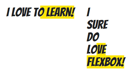
برای اینکه هر رنگ به صورت کامل متن مورد نظر را پوشش دهد، ویژگی [tag]background-size: 200%[/tag] را به صورت زیر اعمال میکنیم:.fun-hover {
background-image: -webkit-linear-gradient(left, transparent 50%, #fee603 50%);
background-image: linear-gradient(to right, transparent 50%, #fee603 50%);
background-position: 0;
background-size: 200%;
}با این کار رنگ transparent کل متن را پوشش میدهد. حال، حالت هاور را برای این کلاس تعریف میکنیم:.fun-hover {
background-image: -webkit-linear-gradient(left, transparent 50%, #fee603 50%);
background-image: linear-gradient(to right, transparent 50%, #fee603 50%);
background-position: 0;
background-size: 200%;
}
.fun-hover:hover {
background-position: -100%;
}با این کار زمانی که بر روی لینکها هاور میکنیم، پس زمینه به اندازه ی 100% جابه جا شده و رنگ آن از transparent به زرد تبدیل میشود. برای اینکه این تغییر به صورت یک انیمیشن اعمال شود، به صورت زیر عمل میکنیم:.fun-hover {
background-image: -webkit-linear-gradient(left, transparent 50%, #fee603 50%);
background-image: linear-gradient(to right, transparent 50%, #fee603 50%);
background-position: 0;
background-size: 200%;
-webkit-transition: all 0.4s;
transition: all 0.4s;
}
.fun-hover:hover {
background-position: -100%;
}مدت این تغییر را برابر با 0.4 ثانیه قرار میدهیم؛ بنابراین تغییر پس زمینه در این زمان اتفاق خواهد افتاد. خروجی به صورت زیر خواهد بود: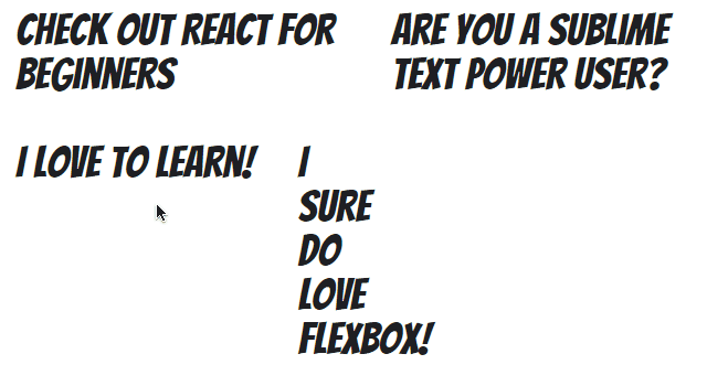
افکت عکس در html
برای استایل دهی به تصاویر خود همیشه لازم نیست که از نرم افزار فتوشاپ استفاده کنید. برخی جلوههای جالب را میتوان با کمک Html، Css و jQuery به دست آورد. در ادامه با نحوه ی ایجاد انواع افکت تصاویر در html با ما همراه باشید. نکته: برخی ویژگیهای CSS که در ادامه به شما کمک میکنند تا افکت هایی زیبا ایجاد کنید، عبارتند از:
- extraImgs: با استفاده از این ویژگی میتوانید تعداد کپی هایی که از تصویر گرفته میشود را تعیین کنید.
- opacity: شفافیت هر عکس را تعیین میکند.
- bgfixed: تعیین میکند که آیا تصویر پس زمینه و اصلی ثابت باشد یا متحرک.
- perspective: با استفاده از این ویژگی میتوانید فاصله ی دید خود را مشخص کنید.
- translateX: میزان جا به جا شدن در جهت x
- translateY : میزان جا به جاشدن در جهت y
- translateZ : میزان جا به جا شدن در جهت z
- rotateX : میزان چرخش حول محور x
- rotateY : میزان چرخش حول محور y
- rotateZ : میزان چرخش حول محور z
ظاهر شدن متن بر روی عکس با رفتن موس روی آن

کدهای Html و Css:
<!DOCTYPE html>
<html>
<head>
<meta name="viewport" content="width=device-width, initial-scale=1">
<style>
.container {
  position: relative;
  width: 50%;
}
.image {
  display: block;
  width: 100%;
  height: auto;
}
.overlay {
  position: absolute;
  top: 0;
  bottom: 0;
  left: 0;
  right: 0;
  height: 100%;
  width: 100%;
  opacity: 0;
  transition: .5s ease;
  background-color: #008CBA;
}
.container:hover .overlay {
  opacity: 1;
}
.text {
  color: white;
  font-size: 20px;
  position: absolute;
  top: 50%;
  left: 50%;
  -webkit-transform: translate(-50%, -50%);
  -ms-transform: translate(-50%, -50%);
  transform: translate(-50%, -50%);
  text-align: center;
}
</style>
</head>
<body>
<h2>Fade in Overlay</h2>
<p>Hover over the image to see the effect.</p>
<div class="container">
  <img src="img_avatar.png" alt="Avatar" class="image">
  <div class="overlay">
    <div class="text">Hello World</div>
  </div>
</div>
</body>
</html>
آموزش ایجاد افکت کم رنگ شدن تصویر با رفتن موس روی آن

کدهای Html و Css:
<!DOCTYPE html>
<html>
<head>
<meta name="viewport" content="width=device-width, initial-scale=1">
<style>
.container {
  position: relative;
  width: 50%;
}
.image {
  opacity: 1;
  display: block;
  width: 100%;
  height: auto;
  transition: .5s ease;
  backface-visibility: hidden;
}
.middle {
  transition: .5s ease;
  opacity: 0;
  position: absolute;
  top: 50%;
  left: 50%;
  transform: translate(-50%, -50%);
  -ms-transform: translate(-50%, -50%);
  text-align: center;
}
.container:hover .image {
  opacity: 0.3;
}
.container:hover .middle {
  opacity: 1;
}
.text {
  background-color: #4CAF50;
  color: white;
  font-size: 16px;
  padding: 16px 32px;
}
</style>
</head>
<body>
<h2>Opacity with Box</h2>
<p>Hover over the image to see the effect.</p>
<div class="container">
  <img src="img_avatar.png" alt="Avatar" class="image" style="width:100%">
  <div class="middle">
    <div class="text">John Doe</div>
  </div>
</div>
  </body>
آموزش ایجاد افکت چرخش تصویر هنگام رفتن موس روی آن
کدهای Html و Css:
<!DOCTYPE html>
<html>
<head>
<style>
div {
  width: 100px;
  height: 100px;
  background: red;
  transition: width 2s, height 2s, transform 2s;
}
div:hover {
  width: 300px;
  height: 300px;
  transform: rotate(180deg);
}
</style>
</head>
<body>
<div></div>
</body>
</html>
کد بزرگ شدن عکس با رفتن موس روی آن تا اندازه دلخواه
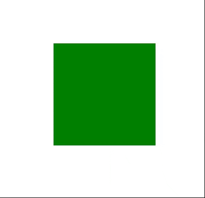
کدهای Html و Css:
<!DOCTYPE html>
<html>
<head>
<meta name="viewport" content="width=device-width, initial-scale=1">
<style>
* {
  box-sizing: border-box;
}
.zoom {
  padding: 50px;
  background-color: green;
  transition: transform .2s;
  width: 200px;
  height: 200px;
  margin: 0 auto;
}
.zoom:hover {
  -ms-transform: scale(1.5); /* IE 9 */
  -webkit-transform: scale(1.5); /* Safari 3-8 */
  transform: scale(1.5);
}
</style>
</head>
<body>
<h1>Zoom on Hover</h1>
<p>Hover over the div element.</p>
  <div class="zoom"></div>
</body>
</html>
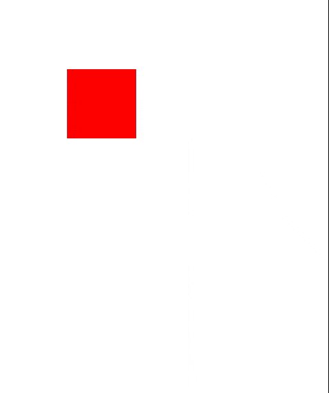
کد ایجاد افکت حرکتی بر روی عکس در html
کدهای Html و Css:
<!DOCTYPE html>
<html>
<head>
<style>
div {
  width: 100px;
  height: 100px;
  background-color: red;
  position: relative;
  animation-name: example;
  animation-duration: 4s;
}
@keyframes example {
  0%   {background-color:red; left:0px; top:0px;}
  25%  {background-color:yellow; left:200px; top:0px;}
  50%  {background-color:blue; left:200px; top:200px;}
  75%  {background-color:green; left:0px; top:200px;}
  100% {background-color:red; left:0px; top:0px;}
}
</style>
</head>
<body>
<div></div>
</body>
</html>
جمع بندی: طراحان وب میتوانند با استفاده ی متناسب از افکت هاور به صفحات وب خود، زیبایی چشم نوازی ببخشند. شما میتوانید با بهره گیری از افکتهای معرفی شده در این مقاله و سفارشی سازی آن ها، زیبایی صفحات خود را چند برابر کنید. همچنین میتوانید از افکتهای موجود در سایت هایی مانند codepen استفاده کنید. اگر از خواندن مقاله ی آموزش hover در CSS لذت بردید، نظرات خود را با ما به اشتراک بگذارید.
اگر به یادگیری بیشتر در زمینه HTML , CSS و طراحی وب علاقه مند هستی با شرکت در دوره آموزش طراحی وب ، در کمتر از یکسال به یک طراح وب همه فن حریف تبدیل میشوی که آماده ی استخدام ، دریافت پروژه و کسب درآمد هستی.


۶۵ دیدگاه
علی
۲۵ آذر ۱۴۰۲، ۱۸:۴۷
نازنین کریمی مقدم
۰۲ دی ۱۴۰۲، ۱۶:۵۴
مانی
۲۳ آذر ۱۴۰۲، ۰۹:۰۰
نازنین کریمی مقدم
۰۲ دی ۱۴۰۲، ۱۸:۰۲
امبر
۱۲ آذر ۱۴۰۲، ۱۹:۳۹
نازنین کریمی مقدم
۱۸ آذر ۱۴۰۲، ۱۳:۱۵
افشاری
۲۱ مهر ۱۴۰۲، ۱۰:۵۵
نازنین کریمی مقدم
۲۲ مهر ۱۴۰۲، ۱۰:۱۶
۲۹ مرداد ۱۴۰۲، ۱۰:۴۲
۲۵ مرداد ۱۴۰۲، ۲۳:۰۳
نازنین کریمی مقدم
۰۶ شهریور ۱۴۰۲، ۰۶:۱۱
۱۹ مرداد ۱۴۰۲، ۱۱:۵۱
نازنین کریمی مقدم
۰۸ شهریور ۱۴۰۲، ۰۵:۳۱
۲۵ تیر ۱۴۰۲، ۱۳:۴۰
نازنین کریمی مقدم
۱۹ شهریور ۱۴۰۲، ۱۱:۰۱
۰۴ خرداد ۱۴۰۲، ۰۶:۳۸
نازنین کریمی مقدم
۲۵ خرداد ۱۴۰۲، ۲۰:۰۰
۲۵ اسفند ۱۴۰۱، ۰۷:۰۱
نازنین کریمی مقدم
۲۵ اسفند ۱۴۰۱، ۱۲:۴۶
۱۶ دی ۱۴۰۱، ۱۷:۲۶
نازنین کریمی مقدم
۱۷ دی ۱۴۰۱، ۰۶:۱۳
۱۶ دی ۱۴۰۱، ۱۷:۰۱
نازنین کریمی مقدم
۱۷ دی ۱۴۰۱، ۰۶:۱۱
۱۶ دی ۱۴۰۱، ۱۰:۳۲
نازنین کریمی مقدم
۱۶ دی ۱۴۰۱، ۱۴:۰۶
۲۲ تیر ۱۴۰۱، ۱۵:۴۷
نازنین کریمی مقدم
۲۶ تیر ۱۴۰۱، ۰۴:۳۲
۱۸ تیر ۱۴۰۱، ۰۷:۵۷
نازنین کریمی مقدم
۱۸ تیر ۱۴۰۱، ۰۹:۲۲
۰۶ خرداد ۱۴۰۱، ۱۹:۳۹
نازنین کریمی مقدم
۰۷ خرداد ۱۴۰۱، ۰۷:۳۵
۱۹ فروردین ۱۴۰۱، ۱۲:۲۶
نازنین کریمی مقدم
۲۰ فروردین ۱۴۰۱، ۱۷:۲۵
۱۲ بهمن ۱۴۰۰، ۱۸:۴۱
نازنین کریمی مقدم
۱۳ بهمن ۱۴۰۰، ۱۲:۵۰
۰۶ بهمن ۱۴۰۰، ۱۵:۵۰
نازنین کریمی مقدم
۰۹ بهمن ۱۴۰۰، ۱۱:۵۳
۱۸ دی ۱۴۰۰، ۲۲:۵۲
نازنین کریمی مقدم
۱۹ دی ۱۴۰۰، ۰۵:۳۳
۱۵ دی ۱۴۰۰، ۱۸:۱۵
نازنین کریمی مقدم
۱۷ دی ۱۴۰۰، ۱۶:۱۵
وحید
۱۴ آذر ۱۴۰۰، ۰۸:۴۷
Nazanin KarimiMoghaddam
۱۴ آذر ۱۴۰۰، ۱۱:۲۴
fateme
۱۷ شهریور ۱۴۰۰، ۱۴:۵۱
نازنین کریمی مقدم
۱۹ شهریور ۱۴۰۰، ۱۸:۳۱
محمود
۳۰ خرداد ۱۴۰۰، ۰۴:۰۶
نازنین گودرزی
۳۱ خرداد ۱۴۰۰، ۱۶:۲۴
amir
۰۹ فروردین ۱۴۰۰، ۱۰:۱۳
نازنین کریمی مقدم
۱۸ بهمن ۱۳۹۹، ۰۹:۰۶
آکار
۲۸ آذر ۱۳۹۹، ۰۸:۲۱
نازنین گودرزی
۲۸ آذر ۱۳۹۹، ۱۹:۰۰
یه غریبه
۱۹ آذر ۱۳۹۹، ۱۲:۴۸
نازنین گودرزی
۱۹ آذر ۱۳۹۹، ۱۵:۳۹
فرزاد
۰۴ آبان ۱۳۹۹، ۱۲:۱۸
نازنین گودرزی
۰۴ آبان ۱۳۹۹، ۱۷:۴۸
AminAli
۲۹ شهریور ۱۳۹۹، ۰۷:۲۲
نازنین گودرزی
۲۹ شهریور ۱۳۹۹، ۰۹:۵۱
mohammad
۲۴ شهریور ۱۳۹۹، ۱۳:۴۱
نازنین کریمی مقدم
۰۲ مهر ۱۳۹۹، ۱۰:۵۹
Line Theme
۳۱ مرداد ۱۳۹۹، ۰۹:۵۲
نازنین گودرزی
۳۱ مرداد ۱۳۹۹، ۱۰:۴۹
behrooz
۰۸ خرداد ۱۳۹۹، ۱۴:۴۷
نازنین گودرزی
۰۸ خرداد ۱۳۹۹، ۲۱:۴۱
Mohsen7
۰۸ خرداد ۱۳۹۹، ۱۳:۳۲
نازنین گودرزی
۰۸ خرداد ۱۳۹۹، ۲۱:۴۲

دوره الفبای برنامه نویسی با هدف انتخاب زبان برنامه نویسی مناسب برای شما و پاسخگویی به سوالات متداول در شروع یادگیری موقتا رایگان شد: