۴۱
دیدگاه
نظر

آموزش ساخت منو با CSS و HTML
سرفصلهای مقاله
- ویژگیهای یک منوی استاندارد و کاربردی
- آموزش ساخت منو با CSS و HTML : منوی کشویی یا dropdown menu
- آموزش ساخت منو با CSS و HTML : منوی زیبا و خلاقانه
- آموزش ساخت منو با CSS و HTML : منوی 3d مدل پیانو
- آموزش ساخت منو با CSS و HTML : منوی 3d مکعبی چرخان
- آموزش ساخت منو با CSS و HTML : منوی 3d افقی با افکتهای زیبا
- آموزش ساخت منو با CSS و HTML : منوی 3d مناسب برای وب اپلیکیشن
- آموزش ساخت منو با CSS و HTML : منوی 3d با هاور زیبا
- آموزش ساخت منو با CSS و HTML : منوی 3d حبابی
- آموزش ساخت منو با CSS و HTML : منوی 3d مکعبی رنگارنگ
- ساخت منو به وسیله ی نرم افزار Easy Button and Menu Maker
- ایجاد انواع منوها و باکسهای تب دار در چند گام ساده!
- آموزش ایجاد منوی Sticky با CSS و Javascript
منوی ناوبری لیستی از صفحات اصلی یا خدمات سایت است که معمولاً از مجموعه ای از پیوندها یا آیکونها تشکیل شده است و از نظر ظاهری با سایر محتواهای سایت تفاوتهای چشم گیری دارد. ناوبری تعیین میکند که کاربران به کجا هدایت شوند و چگونه با وب سایت تعامل کنند. بدون وجود پیمایش قابل استفاده، محتوای سایت شما کاملا بی فایده خواهد بود. منوها باید به اندازه کافی ساده و البته جذاب باشند تا کاربران بتوانند به خوبی آن را درک کنند و همچنین با ایجاد خلاقیت و طراحی مناسب عناصر لازم برای راهنمایی کاربر را از طریق وب سایت در خود داشته باشد. قابلیت استفاده، یک هدف اساسی برای هر وب سایتی است و ناوبری قابل استفاده، چیزی است که یک به وب سایت به آن نیاز دارد. موضوعی که کار با ناوبری را در طراحی وب دشوار میکند، تنوع فراوان آن است. ناوبری در سایت میتواند ساده یا پیچیده باشد؛ مانند: چند صفحه اصلی یا یک معماری چند سطحی، یک مجموعه محتوا برای کاربران وارد شده و دیگری برای کاربران مهمان و... . در ادامه ی این مقاله ی آموزش ساخت منو با CSS و HTML ، شما را با نکات طراحی انواع منو با CSS3 و HTML و چندین مثال کاربردی آشنا میکنیم. شما میتوانید از این طرحها در طراحی منوهای سایت خود استفاده کنید یا از آنها الهام بگیرید. همچنین یک نرم افزار کاربردی را به شما معرفی میکنیم که امکان طراحی و ساخت منو را بدون نیاز به کدنویسی برای شما فراهم میکند. با ما همراه باشید.
ویژگیهای یک منوی استاندارد و کاربردی
منوی ناوبری یکی از اصلیترین فاکتورها برای تعیین قابلیت استفاده ی یک سایت است و اگر بازدیدکنندگان بتوانند به راحتی مطالبی را که به دنبال یافتن آن هستند بدون هیچ تلاشی پیدا کنند، به احتمال زیاد به جای بستن صفحه برای ترک سایت، در وب سایت شما خواهند ماند. طراحی منوی ناوبری موثر وب سایت میتواند به سایت شما در افزایش بازدید صفحه، بهبود تجربه ی کاربری و حتی افزایش فروش و سود کمک کند. از آنجا که سایتهای مختلف میتوانند پیمایشهای مختلفی را برای کاربران خود طراحی کنند، میتوان گفت که هیچ دستورالعمل مشخص و یکسانی برای سازماندهی ناوبری وجود ندارد. طراحی ناوبری به خودی خود یک هنر است و طراحان به مرور زمان کسب تجربههای بیشتر در آن مهارت پیدا میکنند. طراحی خوب منوهای یک وب سایت، از معماری در نظر گرفته شده برای اطلاعات آن به دست میآید: معماری سایت عبارت است از: "هنر بیان یک مدل یا مفهوم اطلاعات مورد استفاده در فعالیت هایی که نیاز به جزییات صریح سیستمهای پیچیده دارند". طراحی یک منوی ناوبری کاربرپسند و استاندارد چندان دشوار نیست، اما باید پیش از این کار، نکات زیر را به خوبی درک کرده باشید:
پیدا کردن آسان
کاربران باید بتوانند منوی ناوبری را به راحتی و به سرعت پیدا کنند. رنگ، فونت و اندازه متن ناوبری شما نباید با محتوای صفحات شما یکسان باشد بلکه میبایست برجسته و آشکار باشد. علاوه بر این، منطقه ناوبری باید اندازه ی فونت خاصی را حفظ کند و در بالای صفحه، سمت چپ و یا راست (منطقه رایج مورد استفاده) قرار گیرد.
استفاده ی آسان
گزینههای منو باید به اندازه کافی بزرگ باشد تا عمل کلیک را تسهیل کند. اگر گزینههای منوی ناوبری خیلی کوچک یا خیلی نزدیک به هم باشند، برای کاربران موبایل مشکل بزرگی ایجاد میکنند. کاربران دوست ندارند که درگیر درک نحوه ی کار با گزینههای منو شوند و اگر چنین اتفاقی رخ دهد، آنها را از دست میدهید!
قابلیت کلیک
اطمینان حاصل کنید که همه ی عناصر منو، قابل کلیک هستند. هنگام استفاده از چندین دایرکتوری طبقه بندی شده در ناوبری، همه ی عناصر باید لینکهای قابل کلیک باشند.
ثبات
سازگاری مهمترین اصل در طراحی منوی ناوبری است. اگر سایت شما حالات متفاوتی برای نمایش منوی ناوبری دارد، کاربران ممکن است به جای سایت شما، خود را در سایت دیگری تصور کنند. بنابراین حتماً از حالت ناوبری یکسان استفاده کنید تا کاربران بتوانند به راحتی به سایت شما دسترسی پیدا کنند.
وضوح
متن منوی شما باید روشن، کوتاه، توصیفی و متمرکز باشد. با استفاده از اصطلاحات ساده و سر راست، اجازه ندهید که کاربر به معنای متن فکر کند زیرا این مورد باعث یک تجربه کاربری بد خواهد شد.
سادگی
می توانید موارد بیشتری را به ناوبری عمودی اضافه کنید، اما نمیتوانید موارد زیادی را در منوی اصلی داشته باشید زیرا منجر به حواس پرتی کاربر میشود. به طور کلی، توصیه میشود آیتمهای منوی اصلی بیش از 8 مورد نباشند.
استایل
مینیمالیسم هنوز هم یکی از ترندهای طراحی وب است، یک سبک بصری منحصر به فرد که باعث میشود منوی شما جالب به نظر برسد، اما مطمئن شوید که با سبک طراحی کلی کل سایت مطابقت دارد.
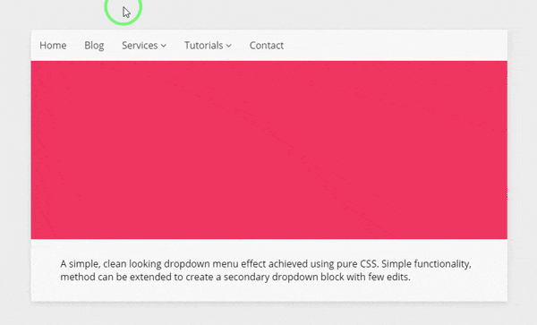
آموزش ساخت منو با CSS و HTML : منوی کشویی یا dropdown menu
 کدهای HTML:
.container
    .tutorial
      ul
        li Home
        li Blog
        li Services
          i.fa.fa-angle-down
          ul
            li Graphic Design
            li Website Design
            li Python Programming
            li PHP Programming
        li Tutorials
          i.fa.fa-angle-down
          ul
            li CSS
              span 12 Available
            li HTML
              span 9 Available
            li Jade
              span 3 Available
            li Javascript
              span 21 Available
            li Design
              span 37 Available
        li Contact
      .slider
      .information
        p A simple, clean looking dropdown menu effect achieved using pure CSS. Simple functionality, method can be extended to create a secondary dropdown block with few edits.
<link href='https://fonts.googleapis.com/css?family=Open+Sans:400,300,600' rel='stylesheet' type='text/css'>
<link href="//maxcdn.bootstrapcdn.com/font-awesome/4.2.0/css/font-awesome.min.css" rel="stylesheet">
کدهای CSS:
//variables
$background-purple: #EEEEEE;
$subtle-white: #f9f9f9;
$subtle-grey: #f2f2f2;
$masked-grey: #333;
$blue: #F03861;
$open-sans: 'Open Sans', sans-serif;
*,
*:before,
*:after {
  margin: 0;
  padding: 0;
  box-sizing: border-box;
}
body, html {
  height: 100%;
  background-color: $background-purple;
}
// page container
.container {
  width: 100%;
  height: 100%;
}
// tutorial start
.tutorial {
  width: 80%;
  margin: 5% auto 0 auto;
  box-shadow: 0 4px 12px rgba(black, 0.1);
  background-color: $subtle-white;
  max-width: 800px;
.slider {
  width: 100%;
  height: 300px;
  background-color: $blue;
}
.information {
  width: 100%;
  padding: 20px 50px;
  margin-bottom: 30px;
  font-family: $open-sans;
  h1 {
    color: $masked-grey;
    font-size: 1.5rem;
    padding: 0px 10px;
    border-left: 3px solid $blue;
  }
  h3 {
    color: darken($subtle-grey, 7%);
    font-size: 1rem;
    font-weight: 300;
    padding: 0px 10px;
    border-left: 3px solid $blue;
  }
  p {
    padding: 10px 0px;
  }
}
  ul {
    font-size: 0;
    list-style-type: none;
    // initial li
    li {
      font-family: $open-sans;
      font-size: 1rem;
      font-weight: 400;
      color: $masked-grey;
      display: inline-block;
      padding: 15px;
      position: relative;
       // secondary ul
        ul {
          display: none;
        }
      // initial li:hover
      &:hover {
        cursor: pointer;
        background-color: $subtle-grey;
        // secondary ul visibility change
        ul {
          display: block;
          margin-top: 15px;
          width: 200px;
          left: 0;
          position: absolute;
          // secondary li
          li {
            display: block;
            background-color: darken($subtle-white, 7%);
            span {
              float: right;
              color: $subtle-white;
              background-color: $blue;
              padding: 2px 5px;
              text-align: center;
              font-size: .8rem;
              border-radius: 3px;
            }
            &:hover {
              background-color: darken($subtle-white, 10%);
              span {
                background-color: darken($blue, 5%);
              }
            }
          }
        }
      }
    }
  }
}
آموزش ساخت منو با CSS و HTML : منوی زیبا و خلاقانه
 کدهای HTML:
<nav class="nav">
  <input type="checkbox" class="nav__cb" id="menu-cb"/>
  <div class="nav__content">
    <ul class="nav__items">
      <li class="nav__item">
        <span class="nav__item-text">
          Home
        </span>
      </li>
      <li class="nav__item">
        <span class="nav__item-text">
          Works
        </span>
      </li>
      <li class="nav__item">
        <span class="nav__item-text">
          About
        </span>
      </li>
      <li class="nav__item">
        <span class="nav__item-text">
          Contact
        </span>
      </li>
    </ul>
  </div>
  <label class="nav__btn" for="menu-cb"></label>
</nav>
کدهای CSS:
*, *:before, *:after {
box-sizing: border-box;
margin: 0;
padding: 0;
}
html, body {
height: 100%;
}
$lightBlue: darken(#EAFBFF, 50%);
$darkBlue: #208FF9;
body {
&:before,
&:after {
content: "";
display: block;
height: 50%;
background: $lightBlue;
}
&:after {
background: $darkBlue;
}
}
/* MAIN VARIABLES FOR CUSTOMIZATION */
$numOfItems: 4;
$navAT: 1s;
$textDelayStep: 0.1s;
/* -------------------------------- */
$font: Helvetica, Arial, sans-serif;
$btnSize: 90px;
$lineW: 28px;
$lineH: 4px;
$linesGap: 10px;
$linesTotalH: $lineH*2 + $linesGap;
$btnHorPad: ($btnSize - $lineW) / 2;
$btnVertPad: ($btnSize - $linesTotalH) / 2;
$itemsLeftPad: 20px;
$itemsRightPad: $itemsLeftPad + $btnSize;
$itemWidth: 70px;
$navItemsWidth: $itemsLeftPad + $itemsRightPad + $itemWidth * $numOfItems;
$textAT: $navAT - $textDelayStep * ($numOfItems - 1);
$textFadeAT: 0.2s;
$cub: cubic-bezier(.48,.43,.29,1.3);
$backCub: cubic-bezier(0.49,-0.3,.68,1.23);
$textCub: cubic-bezier(.48,.43,.7,2.5);
.nav {
overflow: hidden;
position: absolute;
left: 50%;
top: 50%;
width: auto;
height: $btnSize;
margin-top: $btnSize/-2;
background: #fff;
border-radius: 5px;
transform: translate3d(-50%,0,0);
box-shadow: 0 10px 35px rgba(0,0,0,0.2);
&__cb {
z-index: -1000;
position: absolute;
left: 0;
top: 0;
opacity: 0;
pointer-events: none;
}
&__content {
position: relative;
width: $btnSize;
height: 100%;
transition: width $navAT $backCub;
.nav__cb:checked ~ & {
transition: width $navAT $cub;
width: $navItemsWidth;
}
}
&__items {
position: relative;
width: $navItemsWidth;
height: 100%;
padding-left: $itemsLeftPad;
padding-right: $itemsRightPad;
list-style-type: none;
font-size: 0;
}
&__item {
display: inline-block;
vertical-align: top;
width: $itemWidth;
text-align: center;
color: #6C7784;
font-size: 14px;
line-height: $btnSize;
font-family: $font;
font-weight: bold;
perspective: 1000px;
transition: color 0.3s;
cursor: pointer;
&:hover {
color: $lightBlue;
}
&-text {
display: block;
height: 100%;
transform: rotateY(-70deg);
opacity: 0;
transition: transform $textAT $textCub, opacity $textAT;
.nav__cb:checked ~ .nav__content & {
transform: rotateY(0);
opacity: 1;
transition: transform $textAT $textCub, opacity $textFadeAT;
}
@for $i from 1 through $numOfItems {
.nav__item:nth-child(#{$i}) & {
transition-delay: ($numOfItems - $i) * $textDelayStep;
}
.nav__cb:checked ~ .nav__content .nav__item:nth-child(#{$i}) & {
transition-delay: ($i - 1) * $textDelayStep;
}
}
}
}
&__btn {
position: absolute;
right: 0;
top: 0;
width: $btnSize;
height: $btnSize;
padding: $btnVertPad $btnHorPad;
cursor: pointer;
&:before,
&:after {
content: "";
display: block;
width: $lineW;
height: $lineH;
border-radius: 2px;
background: #096DD3;
transform-origin: 50% 50%;
transition: transform $navAT $cub, background-color 0.3s;
}
&:before {
margin-bottom: $linesGap;
}
&:hover {
&:before,
&:after {
background: $lightBlue;
}
}
.nav__cb:checked ~ & {
&:before {
transform: translateY($linesGap/2 + $lineH/2) rotate(-225deg);
}
&:after {
transform: translateY($linesGap/-2 + $lineH/-2) rotate(225deg);
}
}
}
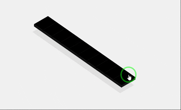
}آموزش ساخت منو با CSS و HTML : منوی 3d مدل پیانو
 کدهای HTML:<ul>
<li>
<a class='list-item' href=''>
<i class='icon-reorder'></i>
</a>
</li>
<li>
<a class='list-item' href=''>
<i class='icon-th-large'></i>
</a>
</li>
<li>
<a class='list-item' href=''>
<i class='icon-bar-chart'></i>
</a>
</li>
<li>
<a class='list-item' href=''>
<i class='icon-tasks'></i>
</a>
</li>
<li>
<a class='list-item' href=''>
<i class='icon-bell'></i>
</a>
</li>
<li>
<a class='list-item' href=''>
<i class='icon-archive'></i>
</a>
</li>
<li>
<a class='list-item' href=''>
<i class='icon-comment'></i>
</a>
</li>
<li>
<a class='list-item' href=''>
<i class='icon-sitemap'></i>
</a>
</li>
<li>
<a class='list-item' href=''>
<i class='icon-thumbs-up'></i>
</a>
</li>
<li>
<a class='list-item' href=''>
<i class='icon-tumblr'></i>
</a>
</li>
</ul>کدهای CSS:* {
-moz-box-sizing: border-box;
-webkit-box-sizing: border-box;
box-sizing: border-box;
}
html {
width: 100%;
height: 100%;
}
body {
width: 100%;
height: 100%;
display: box;
box-align: center;
box-pack: center;
transform: translate3d(0, 0, 0);
overflow: hidden;
}
.clearfix {
zoom: 1;
}
.clearfix:before, .clearfix:after {
content: "020";
display: block;
height: 0;
overflow: hidden;
}
.clearfix:after {
clear: both;
}
body {
background: #f2f2f2;
}
ul {
list-style: none;
margin-left: 500px;
position: relative;
-moz-transform: rotate(-35deg) skew(20deg, 5deg);
-ms-transform: rotate(-35deg) skew(20deg, 5deg);
-webkit-transform: rotate(-35deg) skew(20deg, 5deg);
transform: rotate(-35deg) skew(20deg, 5deg);
}
.list-item {
background: #000000;
color: #575757;
text-align: center;
height: 2.5em;
width: 4em;
vertical-align: middle;
line-height: 2.5em;
border-bottom: 1px solid #060606;
position: relative;
display: block;
text-decoration: none;
-moz-box-shadow: -2em 1.5em 0 #e1e1e1;
-webkit-box-shadow: -2em 1.5em 0 #e1e1e1;
box-shadow: -2em 1.5em 0 #e1e1e1;
-moz-transition: all 0.25s linear;
-o-transition: all 0.25s linear;
-webkit-transition: all 0.25s linear;
transition: all 0.25s linear;
}
.list-item:hover {
background: #ff6e42;
color: #fffcfb;
-moz-transform: translate(0.9em, -0.9em);
-ms-transform: translate(0.9em, -0.9em);
-webkit-transform: translate(0.9em, -0.9em);
transform: translate(0.9em, -0.9em);
-moz-transition: all 0.25s linear;
-o-transition: all 0.25s linear;
-webkit-transition: all 0.25s linear;
transition: all 0.25s linear;
-moz-box-shadow: -2em 2em 0 #e1e1e1;
-webkit-box-shadow: -2em 2em 0 #e1e1e1;
box-shadow: -2em 2em 0 #e1e1e1;
}
.list-item:hover:before, .list-item:hover:after {
-moz-transition: all 0.25s linear;
-o-transition: all 0.25s linear;
-webkit-transition: all 0.25s linear;
transition: all 0.25s linear;
}
.list-item:hover:before {
background: #b65234;
width: 1em;
top: 0.5em;
left: -1em;
}
.list-item:hover:after {
background: #b65234;
width: 1em;
bottom: -2.5em;
left: 1em;
height: 4em;
}
.list-item:before, .list-item:after {
-moz-transition: all 0.25s linear;
-o-transition: all 0.25s linear;
-webkit-transition: all 0.25s linear;
transition: all 0.25s linear;
}
.list-item:after {
content: "";
position: absolute;
height: 4em;
background: #181818;
width: 0.5em;
bottom: -2.25em;
left: 1.5em;
-moz-transform: rotate(90deg) skew(0deg, 45deg);
-ms-transform: rotate(90deg) skew(0deg, 45deg);
-webkit-transform: rotate(90deg) skew(0deg, 45deg);
transform: rotate(90deg) skew(0deg, 45deg);
}
.list-item:before {
content: "";
position: absolute;
height: 2.5em;
background: #121212;
width: 0.5em;
top: 0.25em;
left: -0.5em;
-moz-transform: skewY(-45deg);
-ms-transform: skewY(-45deg);
-webkit-transform: skewY(-45deg);
transform: skewY(-45deg);
}
کدهای HTML:<ul>
<li>
<a class='list-item' href=''>
<i class='icon-reorder'></i>
</a>
</li>
<li>
<a class='list-item' href=''>
<i class='icon-th-large'></i>
</a>
</li>
<li>
<a class='list-item' href=''>
<i class='icon-bar-chart'></i>
</a>
</li>
<li>
<a class='list-item' href=''>
<i class='icon-tasks'></i>
</a>
</li>
<li>
<a class='list-item' href=''>
<i class='icon-bell'></i>
</a>
</li>
<li>
<a class='list-item' href=''>
<i class='icon-archive'></i>
</a>
</li>
<li>
<a class='list-item' href=''>
<i class='icon-comment'></i>
</a>
</li>
<li>
<a class='list-item' href=''>
<i class='icon-sitemap'></i>
</a>
</li>
<li>
<a class='list-item' href=''>
<i class='icon-thumbs-up'></i>
</a>
</li>
<li>
<a class='list-item' href=''>
<i class='icon-tumblr'></i>
</a>
</li>
</ul>کدهای CSS:* {
-moz-box-sizing: border-box;
-webkit-box-sizing: border-box;
box-sizing: border-box;
}
html {
width: 100%;
height: 100%;
}
body {
width: 100%;
height: 100%;
display: box;
box-align: center;
box-pack: center;
transform: translate3d(0, 0, 0);
overflow: hidden;
}
.clearfix {
zoom: 1;
}
.clearfix:before, .clearfix:after {
content: "020";
display: block;
height: 0;
overflow: hidden;
}
.clearfix:after {
clear: both;
}
body {
background: #f2f2f2;
}
ul {
list-style: none;
margin-left: 500px;
position: relative;
-moz-transform: rotate(-35deg) skew(20deg, 5deg);
-ms-transform: rotate(-35deg) skew(20deg, 5deg);
-webkit-transform: rotate(-35deg) skew(20deg, 5deg);
transform: rotate(-35deg) skew(20deg, 5deg);
}
.list-item {
background: #000000;
color: #575757;
text-align: center;
height: 2.5em;
width: 4em;
vertical-align: middle;
line-height: 2.5em;
border-bottom: 1px solid #060606;
position: relative;
display: block;
text-decoration: none;
-moz-box-shadow: -2em 1.5em 0 #e1e1e1;
-webkit-box-shadow: -2em 1.5em 0 #e1e1e1;
box-shadow: -2em 1.5em 0 #e1e1e1;
-moz-transition: all 0.25s linear;
-o-transition: all 0.25s linear;
-webkit-transition: all 0.25s linear;
transition: all 0.25s linear;
}
.list-item:hover {
background: #ff6e42;
color: #fffcfb;
-moz-transform: translate(0.9em, -0.9em);
-ms-transform: translate(0.9em, -0.9em);
-webkit-transform: translate(0.9em, -0.9em);
transform: translate(0.9em, -0.9em);
-moz-transition: all 0.25s linear;
-o-transition: all 0.25s linear;
-webkit-transition: all 0.25s linear;
transition: all 0.25s linear;
-moz-box-shadow: -2em 2em 0 #e1e1e1;
-webkit-box-shadow: -2em 2em 0 #e1e1e1;
box-shadow: -2em 2em 0 #e1e1e1;
}
.list-item:hover:before, .list-item:hover:after {
-moz-transition: all 0.25s linear;
-o-transition: all 0.25s linear;
-webkit-transition: all 0.25s linear;
transition: all 0.25s linear;
}
.list-item:hover:before {
background: #b65234;
width: 1em;
top: 0.5em;
left: -1em;
}
.list-item:hover:after {
background: #b65234;
width: 1em;
bottom: -2.5em;
left: 1em;
height: 4em;
}
.list-item:before, .list-item:after {
-moz-transition: all 0.25s linear;
-o-transition: all 0.25s linear;
-webkit-transition: all 0.25s linear;
transition: all 0.25s linear;
}
.list-item:after {
content: "";
position: absolute;
height: 4em;
background: #181818;
width: 0.5em;
bottom: -2.25em;
left: 1.5em;
-moz-transform: rotate(90deg) skew(0deg, 45deg);
-ms-transform: rotate(90deg) skew(0deg, 45deg);
-webkit-transform: rotate(90deg) skew(0deg, 45deg);
transform: rotate(90deg) skew(0deg, 45deg);
}
.list-item:before {
content: "";
position: absolute;
height: 2.5em;
background: #121212;
width: 0.5em;
top: 0.25em;
left: -0.5em;
-moz-transform: skewY(-45deg);
-ms-transform: skewY(-45deg);
-webkit-transform: skewY(-45deg);
transform: skewY(-45deg);
}
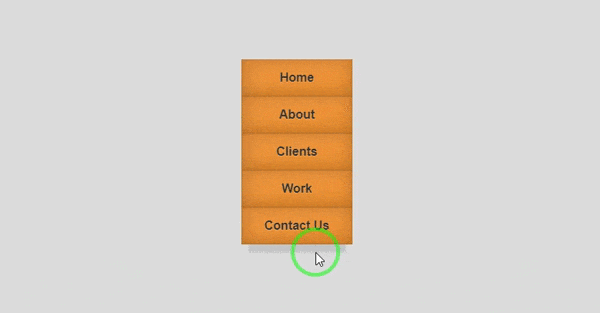
آموزش ساخت منو با CSS و HTML : منوی 3d مکعبی چرخان
 کدهای HTML:
<nav class="mainNav">
    <ul>
        <li><a href="#" data-title="Home">Home</a></li>
        <li><a href="#" data-title="About">About</a></li>
        <li><a href="#" data-title="Clients">Clients</a></li>
        <li><a href="#" data-title="Work">Work</a></li>
        <li><a href="#" data-title="Contact Us">Contact Us</a></li>
    </ul>
</nav>
کدهای CSS:
body {
background-color: #ddd;
font-size: 100%;
padding: 3em;
}
.mainNav {
margin-top:80px;
margin-left:40%;
float: left;
transform: perspective(500px);
transform-style: preserve-3d;
}
.mainNav ul {
list-style: none;
padding: 0;
position: relative;
}
.mainNav ul:after {
background-color: hsla(0,0%,0%,0.1);
box-shadow: 0 0.09375em 0.1875em 0.1875em hsla(0,0%,0%,0.1);
content: '';
height: 0.375em;
left: 0.75em;
position: absolute;
right: 0.75em;
top: 100%;
z-index: -1;
}
.mainNav a {
background-color: #f79533;
background-image: linear-gradient(hsla(0,0%,100%,.05), hsla(0,0%,0%,.05)),
linear-gradient(-197.5deg, hsla(0,0%,100%,.025) 50%, transparent 50%);
backface-visibility: hidden;
box-shadow: inset 0 0 .125em hsla(0,0%,0%,.25),
inset 0 0 1.5em hsla(0,0%,0%,.25);
color: #333;
display: block;
font: bold 1em/3 sans-serif;
padding: 0 1.5em;
position: relative;
text-align: center;
text-decoration: none;
text-shadow: 0 1px 1px hsla(0,0%,100%,.25);
transition: .5s;
transform-origin: 50% 0;
transform-style: preserve-3d;
width: 6em;
}
.mainNav a:after {
background-color: inherit;
background-image: linear-gradient(hsla(0,0%,100%,.05), hsla(0,0%,0%,.05)),
linear-gradient(-197.5deg, hsla(0,0%,100%,.025) 50%, transparent 50%),
linear-gradient(hsla(0,0%,0%,.25), hsla(0,0%,0%,.25));
box-shadow: inset 0 0 .25em hsla(0,0%,0%,.2),
inset 0 0 1.5em hsla(0,0%,0%,.3);
bottom: 0;
color: #fff;
content: attr(data-title);
left: 100%;
line-height: 3;
position: absolute;
top: 0;
transform: rotateY(90deg);
transform-origin: 0 0;
width: 100%;
}
.mainNav a:before {
background-color: inherit;
background-image: linear-gradient(hsla(0,0%,100%,.07), hsla(0,0%,0%,.07)),
linear-gradient(hsla(0,0%,0%,.5), hsla(0,0%,0%,.5));
bottom: 0;
content: '';
height: 9em;
left: 100%;
position: absolute;
top: 0;
transform-origin: 0 0;
width: 100%;
}
.mainNav li:nth-child(-n+2) a:before {
transform: rotateX(-90deg) translateX(-9em) translateZ(3em);
}
.mainNav li:nth-child(n+3) a:before {
transform: rotateX(-90deg) translateX(-9em);
}
.mainNav li:hover a {
transform: rotateY(-90deg) translateX(-4.5em) translateZ(4.5em);
z-index: 100;
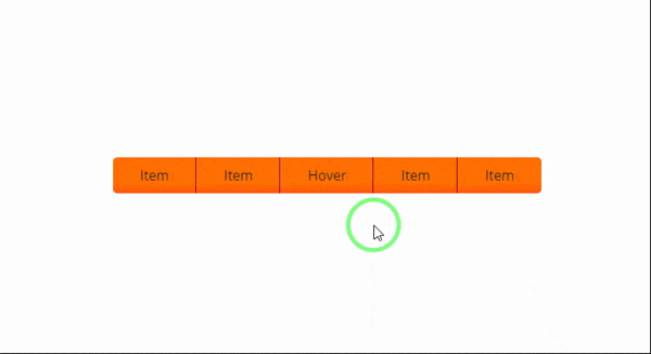
}آموزش ساخت منو با CSS و HTML : منوی 3d افقی با افکتهای زیبا
 کدهای HTML:
<div class="container">
  <nav class="wrapper">
    <ul class="main">
      <li class="front"><a href="#">Item</a></li>
      <li class="front"><a href="#">Item</a></li>
        <li class="front"><a href="#">Hover</a>
          <ul class="sub">
            <li class="bottom"><a href="#">Sub Item</a></li>
            <li class="bottom"><a href="#">Sub Item</a></li>
            <li class="bottom"><a href="#">Sub Item</a></li>
          </ul>
        </li>
      <li class="front"><a href="#">Item</a></li>
      <li class="front"><a href="#">Item</a></li>
    </ul>
  </nav>
</div>
کدهای CSS:
@import url(https://fonts.googleapis.com/css?family=Open+Sans:400,700);
body {
  margin-top:200px;
  padding:0;
  background-image:url(https://www.picturesnew.com/media/images/simplebackgrounds.jpg);
}
span {
  padding:0;
  margin:0;
}
nav {
  font-family: 'Open Sans', sans-serif;
  color:#1d1d1d;
  margin:0 auto;
  width:541px;
}
a {
  text-decoration:none;
  color:inherit;
}
nav ul ul {
  -webkit-transition:all 500ms ease-in-out 500ms;
  -moz-transition:all 500ms ease-in-out 500ms;
  -ms-transition:all 500ms ease-in-out 500ms;
  -o-transition:all 500ms ease-in-out 500ms;
  transition:all 500ms ease-in-out 500ms;
  -webkit-transform:rotateX(-90deg);
  -moz-transform:rotateX(-90deg);
  -ms-transform:rotateX(-90deg);
  -o-transform:rotateX(-90deg);
  transform:rotateX(-90deg);
  -webkit-transform-origin:0% 0%;
  -moz-transform-origin:0% 0%;
  -ms-transform-origin:0% 0%;
  -o-transform-origin:0% 0%;
  transform-origin:0% 0%;
  -webkit-backface-visibility:hidden;
  -moz-backface-visibility:hidden;
  -ms-backface-visibility:hidden;
  -o-backface-visibility:hidden;
  backface-visibility:hidden;
  -webkit-box-shadow: 0px -100px 500px rgba(0,0,0,0);
	box-shadow: 0px -100px 500px rgba(0,0,0,0);
}
nav ul li:hover > ul {
	-webkit-transition:all 500ms ease-in-out 0ms;
  -moz-transition:all 500ms ease-in-out 0ms;
  -ms-transition:all 500ms ease-in-out 0ms;
  -o-transition:all 500ms ease-in-out 0ms;
  transition:all 500ms ease-in-out 0ms;
  -webkit-transform:rotateX(0deg);
  -moz-transform:rotateX(0deg);
  -ms-transform:rotateX(0deg);
  -o-transform:rotateX(0deg);
  transform:rotateX(0deg);
  -webkit-box-shadow: 10px 10px 10px rgba(0,0,0,0.1);
	box-shadow: 10px 10px 10px rgba(0,0,0,0.1);
}
nav ul {
  background-image:-webkit-linear-gradient(top, #ff7000 70%, #ff560f 100%);
  background-image:linear-gradient(to bottom, #ff7000 70%, #ff560f 100%);
  padding: 0;
  list-style:none;
  position:relative;
  display:inline-table;
  border-radius:5px;
  -webkit-transform-style:preserve-3d;
  transform-style:preserve-3d;
  -webkit-perspective:200px;
  -ms-perspective:200px;
  perspective:200px;
}
nav ul:after {
  content:"";
  clear:both;
  display:block;
}
nav ul li {
  float:left;
  -webkit-transform-style:preserve-3d;
  transform-style:preserve-3d;
  -webkit-perspective:200px;
  -ms-perspective:200px;
  perspective:200px;
  border-right:1px solid #890456;
}
nav ul > li:last-of-type {
  border-right:none;
  border-radius:0 5px 5px 0;
}
nav ul span li {
  border-right:1px solid #890456;
}
nav ul li:first-of-type {
  border-radius:5px 0 0 5px;
}
nav ul li:hover {
  background-image:-webkit-linear-gradient(top, #ff8931 , #ff5012);
  background-image:linear-gradient(to bottom, #ff8931 , #ff5012);
}
nav ul li:hover > a {
  color:#fff;
}
nav ul li a {
  display:block;
  padding:10px 31px 10px 32px;
}
nav ul ul {
  position:absolute;
  top:100%;
  padding:0;
  border-radius:0 0 5px 5px;
  background:#ff560f;
}
nav ul ul li {
  float:none;
  position:relative;
  border:none;
}
nav ul ul li:last-of-type {
  border-radius: 0 0 5px 5px;
}
nav ul ul li a {
  padding:8px 21px;
}
آموزش ساخت منو با CSS و HTML : منوی 3d مناسب برای وب اپلیکیشن
کدهای HTML:
 <nav>
   <a href="#first"><i class="far fa-user"></i></a>
   <a href="#second"><i class="fas fa-briefcase"></i></a>
   <a href="#third"><i class="far fa-file"></i></a>
   <a href="#fourth"><i class="far fa-address-card"></i></a>
 </nav>
<div class= 'container'>
  <section id= 'first'>
    <h1>First</h1>
  </section>
  <section id= 'second'>
    <h1>Second</h1>
  </section>
 <section id= 'third'>
   <h1>Third</h1>
  </section>
 <section id= 'fourth'>
   <h1>Fourth</h1>
  </section>
</div>
کدهای CSS:
* {
margin: 0;
padding: 0;
box-sizing: border-box;
}
:root {
--primary-color: #D96AA7;
--secondary-color: #422C73;
--complimentary-color: #88BFB5;
--contrast-color: #F2E527;
--light-color: #D2A9D9;
}
.container {
background: #191919;
min-height: 100vh;
font-family: Montserrat, sans-serif;
}
nav a {
font-size: 40px;
color: #fff;
text-decoration: none;
padding: 20px;
text-align: center;
}
nav {
position: fixed;
left: 0;
z-index: 50;
display: flex;
justify-content: space-around;
flex-direction: column;
height: 100vh;
background: var(--secondary-color);
}
section {
position: absolute;
top: 0;
height: 100vh;
width: 0;
opacity: 0;
transition: all ease-in .5s;
display: flex;
justify-content: center;
align-items: center;
}
section h1 {
color: #fff;
font-size: 50px;
text-transform: uppercase;
opacity: 0;
}
/* Styles applied on trigger */
section:target {
opacity: 1;
position: absolute;
left: 0;
width: 100%;
height: 100%;
z-index: 10;
}
section:target h1 {
opacity: 0;
animation: 2s fadeIn forwards .5s;
}
#first {
background:var(--primary-color);
}
#second {
background: var(--complimentary-color);
}
#third {
background: var(--contrast-color);
}
#fourth {
background: var(--light-color);
}
@keyframes fadeIn {
100% { opacity:1 }
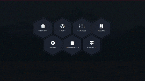
}آموزش ساخت منو با CSS و HTML : منوی 3d با هاور زیبا
 کدهای HTML:
<main class="site-wrapper">
<div class="pt-table desktop-768">
<div class="pt-tablecell page-home relative" style="background-image: url(https://images.unsplash.com/photo-1486870591958-9b9d0d1dda99?ixlib=rb-1.2.1&ixid=eyJhcHBfaWQiOjEyMDd9&auto=format&fit=crop&w=1500&q=80);
background-position: center;
background-size: cover;">
<div class="overlay"></div>
<div class="container">
<div class="row">
<div class="col-xs-12 col-md-offset-1 col-md-10 col-lg-offset-2 col-lg-8">
<div class="page-title home text-center">
<span class="heading-page"> Welcome to My Page
</span>
<p class="mt20">Lorem ipsum dolor sit amet, consectetur adipiscing elit, sed do eiusmod tempor incididunt ut labore et dolore magna aliqua. Ut enim ad minim veniam.</p>
</div>
<div class="hexagon-menu clear">
<div class="hexagon-item">
<div class="hex-item">
<div></div>
<div></div>
<div></div>
</div>
<div class="hex-item">
<div></div>
<div></div>
<div></div>
</div>
<a href="https://www.youtube.com/watch?v=j0_gIAHkaj4&t=9s" target="_blank" class="hex-content">
<span class="hex-content-inner">
<span class="icon">
<i class="fa fa-universal-access"></i>
</span>
<span class="title">Welcome</span>
</span>
<svg viewBox="0 0 173.20508075688772 200" height="200" width="174" version="1.1" xmlns="https://www.w3.org/2000/svg"><path d="M86.60254037844386 0L173.20508075688772 50L173.20508075688772 150L86.60254037844386 200L0 150L0 50Z" fill="#1e2530"></path></svg>
</a>
</div>
<div class="hexagon-item">
<div class="hex-item">
<div></div>
<div></div>
<div></div>
</div>
<div class="hex-item">
<div></div>
<div></div>
<div></div>
</div>
<a href="https://www.youtube.com/watch?v=j0_gIAHkaj4&t=9s" target="_blank" class="hex-content">
<span class="hex-content-inner">
<span class="icon">
<i class="fa fa-bullseye"></i>
</span>
<span class="title">About</span>
</span>
<svg viewBox="0 0 173.20508075688772 200" height="200" width="174" version="1.1" xmlns="https://www.w3.org/2000/svg"><path d="M86.60254037844386 0L173.20508075688772 50L173.20508075688772 150L86.60254037844386 200L0 150L0 50Z" fill="#1e2530"></path></svg>
</a>
</div>
<div class="hexagon-item">
<div class="hex-item">
<div></div>
<div></div>
<div></div>
</div>
<div class="hex-item">
<div></div>
<div></div>
<div></div>
</div>
<a href="https://www.youtube.com/watch?v=j0_gIAHkaj4&t=9s" target="_blank" class="hex-content">
<span class="hex-content-inner">
<span class="icon">
<i class="fa fa-braille"></i>
</span>
<span class="title">Services</span>
</span>
<svg viewBox="0 0 173.20508075688772 200" height="200" width="174" version="1.1" xmlns="https://www.w3.org/2000/svg"><path d="M86.60254037844386 0L173.20508075688772 50L173.20508075688772 150L86.60254037844386 200L0 150L0 50Z" fill="#1e2530"></path></svg>
</a>
</div>
<div class="hexagon-item">
<div class="hex-item">
<div></div>
<div></div>
<div></div>
</div>
<div class="hex-item">
<div></div>
<div></div>
<div></div>
</div>
<a href="https://www.youtube.com/watch?v=j0_gIAHkaj4&t=9s" target="_blank" class="hex-content">
<span class="hex-content-inner">
<span class="icon">
<i class="fa fa-id-badge"></i>
</span>
<span class="title">Resume</span>
</span>
<svg viewBox="0 0 173.20508075688772 200" height="200" width="174" version="1.1" xmlns="https://www.w3.org/2000/svg"><path d="M86.60254037844386 0L173.20508075688772 50L173.20508075688772 150L86.60254037844386 200L0 150L0 50Z" fill="#1e2530"></path></svg>
</a>
</div>
<div class="hexagon-item">
<div class="hex-item">
<div></div>
<div></div>
<div></div>
</div>
<div class="hex-item">
<div></div>
<div></div>
<div></div>
</div>
<a href="https://cakecounter.com" target="_blank" class="hex-content">
<span class="hex-content-inner">
<span class="icon">
<i class="fa fa-life-ring"></i>
</span>
<span class="title">Works</span>
</span>
<svg viewBox="0 0 173.20508075688772 200" height="200" width="174" version="1.1" xmlns="https://www.w3.org/2000/svg"><path d="M86.60254037844386 0L173.20508075688772 50L173.20508075688772 150L86.60254037844386 200L0 150L0 50Z" fill="#1e2530"></path></svg>
</a>
</div>
<div class="hexagon-item">
<div class="hex-item">
<div></div>
<div></div>
<div></div>
</div>
<div class="hex-item">
<div></div>
<div></div>
<div></div>
</div>
<a href="https://www.youtube.com/watch?v=j0_gIAHkaj4&t=9s" target="_blank" class="hex-content">
<span class="hex-content-inner">
<span class="icon">
<i class="fa fa-clipboard"></i>
</span>
<span class="title">Testimonials</span>
</span>
<svg viewBox="0 0 173.20508075688772 200" height="200" width="174" version="1.1" xmlns="https://www.w3.org/2000/svg"><path d="M86.60254037844386 0L173.20508075688772 50L173.20508075688772 150L86.60254037844386 200L0 150L0 50Z" fill="#1e2530"></path></svg>
</a>
</div>
<div class="hexagon-item">
<div class="hex-item">
<div></div>
<div></div>
<div></div>
</div>
<div class="hex-item">
<div></div>
<div></div>
<div></div>
</div>
<a href="https://www.youtube.com/watch?v=j0_gIAHkaj4&t=9s" target="_blank" class="hex-content">
<span class="hex-content-inner">
<span class="icon">
<i class="fa fa-map-signs"></i>
</span>
<span class="title">Contact</span>
</span>
<svg viewBox="0 0 173.20508075688772 200" height="200" width="174" version="1.1" xmlns="https://www.w3.org/2000/svg"><path d="M86.60254037844386 0L173.20508075688772 50L173.20508075688772 150L86.60254037844386 200L0 150L0 50Z" fill="#1e2530"></path></svg>
</a>
</div>
</div>
</div>
</div>
</div>
</div>
</div>
</main>کدهای CSS:
body {
  font-family: "Libre Baskerville", serif;
  font-weight: 400;
  font-size: 16px;
  line-height: 30px;
  background-color: #0c0f15;
  color: #ababab; }
::-webkit-scrollbar {
    width: 10px;
    background-color: #F5F5F5;
}
::-webkit-scrollbar-thumb {
    background-color: #f90a23;
    background-image: -webkit-linear-gradient(45deg,rgba(255, 255, 255, .2) 25%, transparent 25%, transparent 50%, rgba(255, 255, 255, .2) 50%, rgba(255, 255, 255, .2) 75%, transparent 75%, transparent);
}
::-webkit-scrollbar-track {
    -webkit-box-shadow: inset 0 0 6px rgba(0,0,0,0.3);
    background-color: #F5F5F5;
}
.heading-page
{
      text-transform: uppercase;
    font-size: 43px;
    font-weight: bolder;
    letter-spacing: 3px;
    color: white;
}
a {
  color: inherit;
  -webkit-transition: all 0.3s ease 0s;
  -moz-transition: all 0.3s ease 0s;
  -o-transition: all 0.3s ease 0s;
  transition: all 0.3s ease 0s; }
  a:hover, a:focus {
    color: #ababab;
    text-decoration: none;
    outline: 0 none; }
h1, h2, h3,
h4, h5, h6 {
  color: #1e2530;
  font-family: "Open Sans", sans-serif;
  margin: 0;
  line-height: 1.3; }
p {
  margin-bottom: 20px; }
  p:last-child {
    margin-bottom: 0; }
/*
 * Selection color
 */
::-moz-selection {
  background-color: #FA6862;
  color: #fff; }
::selection {
  background-color: #FA6862;
  color: #fff; }
/*
 *  Reset bootstrap's default style
 */
.form-control::-webkit-input-placeholder,
::-webkit-input-placeholder {
  opacity: 1;
  color: inherit; }
.form-control:-moz-placeholder,
:-moz-placeholder {
  /* Firefox 18- */
  opacity: 1;
  color: inherit; }
.form-control::-moz-placeholder,
::-moz-placeholder {
  /* Firefox 19+ */
  opacity: 1;
  color: inherit; }
.form-control:-ms-input-placeholder,
:-ms-input-placeholder {
  opacity: 1;
  color: inherit; }
button, input, select,
textarea, label {
  font-weight: 400; }
.btn {
  -webkit-transition: all 0.3s ease 0s;
  -moz-transition: all 0.3s ease 0s;
  -o-transition: all 0.3s ease 0s;
  transition: all 0.3s ease 0s; }
  .btn:hover, .btn:focus, .btn:active:focus {
    outline: 0 none; }
.btn-primary {
  background-color: #FA6862;
  border: 0;
  font-family: "Open Sans", sans-serif;
  font-weight: 700;
  height: 48px;
  line-height: 50px;
  padding: 0 42px;
  text-transform: uppercase; }
  .btn-primary:hover, .btn-primary:focus, .btn-primary:active, .btn-primary:active:focus {
    background-color: #f9423a; }
.btn-border {
  border: 1px solid #d7d8db;
  display: inline-block;
  padding: 7px; }
/*
 *  CSS Helper Class
 */
.clear:before, .clear:after {
  content: " ";
  display: table; }
.clear:after {
  clear: both; }
.pt-table {
  display: table;
  width: 100%;
  height: -webkit-calc(100vh - 4px);
  height: -moz-calc(100vh - 4px);
  height: calc(100vh - 4px); }
.pt-tablecell {
  display: table-cell;
  vertical-align: middle; }
.overlay {
  position: absolute;
  left: 0;
  top: 0;
  width: 100%;
  height: 100%; }
.relative {
  position: relative; }
.primary,
.link:hover {
  color: #FA6862; }
.no-gutter {
  margin-left: 0;
  margin-right: 0; }
  .no-gutter > [class^="col-"] {
    padding-left: 0;
    padding-right: 0; }
.flex {
  display: -webkit-box;
  display: -webkit-flex;
  display: -moz-flex;
  display: -ms-flexbox;
  display: flex; }
.flex-middle {
  -webkit-box-align: center;
  -ms-flex-align: center;
  -webkit-align-items: center;
  -moz-align-items: center;
  align-items: center; }
.space-between {
  -webkit-box-pack: justify;
  -ms-flex-pack: justify;
  -webkit-justify-content: space-between;
  -moz-justify-content: space-between;
  justify-content: space-between; }
.nicescroll-cursors {
  background: #FA6862 !important; }
.preloader {
  bottom: 0;
  left: 0;
  position: fixed;
  right: 0;
  top: 0;
  z-index: 1000;
  display: -webkit-box;
  display: -webkit-flex;
  display: -moz-flex;
  display: -ms-flexbox;
  display: flex; }
  .preloader.active.hidden {
    display: none; }
.loading-mask {
  background-color: #FA6862;
  height: 100%;
  left: 0;
  position: absolute;
  top: 0;
  width: 20%;
  -webkit-transition: all 0.6s cubic-bezier(0.61, 0, 0.6, 1) 0s;
  -moz-transition: all 0.6s cubic-bezier(0.61, 0, 0.6, 1) 0s;
  -o-transition: all 0.6s cubic-bezier(0.61, 0, 0.6, 1) 0s;
  transition: all 0.6s cubic-bezier(0.61, 0, 0.6, 1) 0s; }
  .loading-mask:nth-child(2) {
    left: 20%;
    -webkit-transition-delay: 0.1s;
    -moz-transition-delay: 0.1s;
    -o-transition-delay: 0.1s;
    transition-delay: 0.1s; }
  .loading-mask:nth-child(3) {
    left: 40%;
    -webkit-transition-delay: 0.2s;
    -moz-transition-delay: 0.2s;
    -o-transition-delay: 0.2s;
    transition-delay: 0.2s; }
  .loading-mask:nth-child(4) {
    left: 60%;
    -webkit-transition-delay: 0.3s;
    -moz-transition-delay: 0.3s;
    -o-transition-delay: 0.3s;
    transition-delay: 0.3s; }
  .loading-mask:nth-child(5) {
    left: 80%;
    -webkit-transition-delay: 0.4s;
    -moz-transition-delay: 0.4s;
    -o-transition-delay: 0.4s;
    transition-delay: 0.4s; }
.preloader.active.done {
  z-index: 0; }
.preloader.active .loading-mask {
  width: 0; }
/*------------------------------------------------
	Start Styling
-------------------------------------------------*/
.mt20{margin-top:20px;}
.site-wrapper {
  border-top: 4px solid #ff0037; }
.page-close {
  font-size: 30px;
  position: absolute;
  right: 30px;
  top: 30px;
  z-index: 100; }
.page-title {
  margin-bottom: 75px; }
  .page-title img {
    margin-bottom: 20px; }
  .page-title h2 {
    font-size: 68px;
    margin-bottom: 25px;
    position: relative;
    z-index: 0;
    font-weight: 900;
    text-transform: uppercase; }
  .page-title p {
    font-size: 16px; }
  .page-title .title-bg {
    color: rgba(30, 37, 48, 0.07);
    font-size: 158px;
    left: 0;
    letter-spacing: 10px;
    line-height: 0.7;
    position: absolute;
    right: 0;
    top: 50%;
    z-index: -1;
    -webkit-transform: translateY(-50%);
    -moz-transform: translateY(-50%);
    -ms-transform: translateY(-50%);
    -o-transform: translateY(-50%);
    transform: translateY(-50%); }
.section-title {
  margin-bottom: 20px; }
  .section-title h3 {
    display: inline-block;
    position: relative; }
    .section-title h3::before, .section-title h3::after {
      content: "";
      height: 2px;
      position: absolute;
      bottom: 8px;
      left: -webkit-calc(100% + 14px);
      left: -moz-calc(100% + 14px);
      left: calc(100% + 14px); }
    .section-title h3::before {
      background-color: #1e2530;
      width: 96px;
      bottom: 14px; }
    .section-title h3::after {
      background-color: #FA6862;
      width: 73px; }
  .section-title.light h3 {
    color: #fff; }
    .section-title.light h3::before {
      background-color: #fff; }
.page-nav {
  bottom: 40px;
  left: 0;
  position: absolute;
  right: 0; }
  .page-nav span {
    font-family: "Open Sans", sans-serif;
    font-size: 14px;
    font-weight: 500;
    line-height: 0.9;
    text-transform: uppercase; }
/*------------------------------------------------
    Home Page
-------------------------------------------------*/
.hexagon-item:first-child {
    margin-left: 0;
}
.page-home {
  background-position: center center;
  background-repeat: no-repeat;
  background-size: cover;
  vertical-align: middle; }
  .page-home .overlay {
    background-color: rgba(14, 17, 24, 0.97);
}
/* End of container */
.hexagon-item {
  cursor: pointer;
  width: 200px;
  height: 173.20508px;
  float: left;
  margin-left: -29px;
  z-index: 0;
  position: relative;
  -webkit-transform: rotate(30deg);
  -moz-transform: rotate(30deg);
  -ms-transform: rotate(30deg);
  -o-transform: rotate(30deg);
  transform: rotate(30deg); }
  .hexagon-item:first-child {
    margin-left: 0; }
  .hexagon-item:hover {
    z-index: 1; }
    .hexagon-item:hover .hex-item:last-child {
      opacity: 1;
      -webkit-transform: scale(1.3);
      -moz-transform: scale(1.3);
      -ms-transform: scale(1.3);
      -o-transform: scale(1.3);
      transform: scale(1.3); }
    .hexagon-item:hover .hex-item:first-child {
      opacity: 1;
      -webkit-transform: scale(1.2);
      -moz-transform: scale(1.2);
      -ms-transform: scale(1.2);
      -o-transform: scale(1.2);
      transform: scale(1.2); }
      .hexagon-item:hover .hex-item:first-child div:before,
      .hexagon-item:hover .hex-item:first-child div:after {
        height: 5px; }
    .hexagon-item:hover .hex-item div::before,
    .hexagon-item:hover .hex-item div::after {
      background-color: #ff0037; }
    .hexagon-item:hover .hex-content svg {
      -webkit-transform: scale(0.97);
      -moz-transform: scale(0.97);
      -ms-transform: scale(0.97);
      -o-transform: scale(0.97);
      transform: scale(0.97); }
.page-home .hexagon-item:nth-last-child(1),
.page-home .hexagon-item:nth-last-child(2),
.page-home .hexagon-item:nth-last-child(3) {
  -webkit-transform: rotate(30deg) translate(87px, -80px);
  -moz-transform: rotate(30deg) translate(87px, -80px);
  -ms-transform: rotate(30deg) translate(87px, -80px);
  -o-transform: rotate(30deg) translate(87px, -80px);
  transform: rotate(30deg) translate(87px, -80px); }
.hex-item {
  position: absolute;
  top: 0;
  left: 50px;
  width: 100px;
  height: 173.20508px; }
  .hex-item:first-child {
    z-index: 0;
    -webkit-transform: scale(0.9);
    -moz-transform: scale(0.9);
    -ms-transform: scale(0.9);
    -o-transform: scale(0.9);
    transform: scale(0.9);
    -webkit-transition: all 0.3s cubic-bezier(0.165, 0.84, 0.44, 1);
    -moz-transition: all 0.3s cubic-bezier(0.165, 0.84, 0.44, 1);
    -o-transition: all 0.3s cubic-bezier(0.165, 0.84, 0.44, 1);
    transition: all 0.3s cubic-bezier(0.165, 0.84, 0.44, 1); }
  .hex-item:last-child {
    transition: all 0.3s cubic-bezier(0.19, 1, 0.22, 1);
    z-index: 1; }
  .hex-item div {
    box-sizing: border-box;
    position: absolute;
    top: 0;
    width: 100px;
    height: 173.20508px;
    -webkit-transform-origin: center center;
    -moz-transform-origin: center center;
    -ms-transform-origin: center center;
    -o-transform-origin: center center;
    transform-origin: center center; }
    .hex-item div::before, .hex-item div::after {
      background-color: #1e2530;
      content: "";
      position: absolute;
      width: 100%;
      height: 3px;
      -webkit-transition: all 0.3s cubic-bezier(0.165, 0.84, 0.44, 1) 0s;
      -moz-transition: all 0.3s cubic-bezier(0.165, 0.84, 0.44, 1) 0s;
      -o-transition: all 0.3s cubic-bezier(0.165, 0.84, 0.44, 1) 0s;
      transition: all 0.3s cubic-bezier(0.165, 0.84, 0.44, 1) 0s; }
    .hex-item div:before {
      top: 0; }
    .hex-item div:after {
      bottom: 0; }
    .hex-item div:nth-child(1) {
      -webkit-transform: rotate(0deg);
      -moz-transform: rotate(0deg);
      -ms-transform: rotate(0deg);
      -o-transform: rotate(0deg);
      transform: rotate(0deg); }
    .hex-item div:nth-child(2) {
      -webkit-transform: rotate(60deg);
      -moz-transform: rotate(60deg);
      -ms-transform: rotate(60deg);
      -o-transform: rotate(60deg);
      transform: rotate(60deg); }
    .hex-item div:nth-child(3) {
      -webkit-transform: rotate(120deg);
      -moz-transform: rotate(120deg);
      -ms-transform: rotate(120deg);
      -o-transform: rotate(120deg);
      transform: rotate(120deg); }
.hex-content {
  color: #fff;
  display: block;
  height: 180px;
  margin: 0 auto;
  position: relative;
  text-align: center;
  transform: rotate(-30deg);
  width: 156px; }
  .hex-content .hex-content-inner {
    left: 50%;
    margin: -3px 0 0 2px;
    position: absolute;
    top: 50%;
    -webkit-transform: translate(-50%, -50%);
    -moz-transform: translate(-50%, -50%);
    -ms-transform: translate(-50%, -50%);
    -o-transform: translate(-50%, -50%);
    transform: translate(-50%, -50%); }
  .hex-content .icon {
    display: block;
    font-size: 36px;
    line-height: 30px;
    margin-bottom: 11px; }
  .hex-content .title {
    display: block;
    font-family: "Open Sans", sans-serif;
    font-size: 14px;
    letter-spacing: 1px;
    line-height: 24px;
    text-transform: uppercase; }
  .hex-content svg {
    left: -7px;
    position: absolute;
    top: -13px;
    transform: scale(0.87);
    z-index: -1;
    -webkit-transition: all 0.3s cubic-bezier(0.165, 0.84, 0.44, 1) 0s;
    -moz-transition: all 0.3s cubic-bezier(0.165, 0.84, 0.44, 1) 0s;
    -o-transition: all 0.3s cubic-bezier(0.165, 0.84, 0.44, 1) 0s;
    transition: all 0.3s cubic-bezier(0.165, 0.84, 0.44, 1) 0s; }
  .hex-content:hover {
    color: #fff; }
.page-home .hexagon-item:nth-last-child(1), .page-home .hexagon-item:nth-last-child(2), .page-home .hexagon-item:nth-last-child(3) {
    -webkit-transform: rotate(30deg) translate(87px, -80px);
    -moz-transform: rotate(30deg) translate(87px, -80px);
    -ms-transform: rotate(30deg) translate(87px, -80px);
    -o-transform: rotate(30deg) translate(87px, -80px);
    transform: rotate(30deg) translate(87px, -80px);
}
/*------------------------------------------------
    Welcome Page
-------------------------------------------------*/
.author-image-large {
  position: absolute;
  right: 0;
  top: 0; }
  .author-image-large img {
    height: -webkit-calc(100vh - 4px);
    height: -moz-calc(100vh - 4px);
    height: calc(100vh - 4px); }
@media (min-width: 1200px)
{
.col-lg-offset-2 {
    margin-left: 16.66666667%;
}
}
@media (min-width: 1200px)
{
.col-lg-8 {
    width: 66.66666667%;
}
}
.hexagon-item:first-child {
    margin-left: 0;
}
.pt-table.desktop-768 .pt-tablecell {
    padding-bottom: 110px;
    padding-top: 60px;
}
.hexagon-item:hover .icon i
{
  color:#ff0037;
  transition:0.6s;
}
.hexagon-item:hover .title
{
  -webkit-animation: focus-in-contract 0.5s cubic-bezier(0.250, 0.460, 0.450, 0.940) both;
	        animation: focus-in-contract 0.5s cubic-bezier(0.250, 0.460, 0.450, 0.940) both;
}
/***************************/
@-webkit-keyframes focus-in-contract {
  0% {
    letter-spacing: 1em;
    -webkit-filter: blur(12px);
            filter: blur(12px);
    opacity: 0;
  }
  100% {
    -webkit-filter: blur(0px);
            filter: blur(0px);
    opacity: 1;
  }
}
@keyframes focus-in-contract {
  0% {
    letter-spacing: 1em;
    -webkit-filter: blur(12px);
            filter: blur(12px);
    opacity: 0;
  }
  100% {
    -webkit-filter: blur(0px);
            filter: blur(0px);
    opacity: 1;
  }
}
@media only screen and (max-width: 767px)
{
.hexagon-item {
    float: none;
    margin: 0 auto 50px;
}
  .hexagon-item:first-child {
    margin-left: auto;
}
  .page-home .hexagon-item:nth-last-child(1), .page-home .hexagon-item:nth-last-child(2), .page-home .hexagon-item:nth-last-child(3) {
    -webkit-transform: rotate(30deg) translate(0px, 0px);
    -moz-transform: rotate(30deg) translate(0px, 0px);
    -ms-transform: rotate(30deg) translate(0px, 0px);
    -o-transform: rotate(30deg) translate(0px, 0px);
    transform: rotate(30deg) translate(0px, 0px);
}
}
آموزش ساخت منو با CSS و HTML : منوی 3d حبابی
 کدهای HTML:
- const randomInRange = (min, max) => Math.floor(Math.random() * (max - min + 1)) + min
- const SECTIONS = ['HOME', 'ABOUT', 'CONTACT', 'WORK']
nav.menu(style=`--hue: ${Math.random() * 360}`)
  input(type='checkbox', id='menu-toggle', class='menu__toggle')
  label(for='menu-toggle', class='menu__toggle-label')
  label(for='menu-toggle', class='menu__toggle-label menu__toggle-label--closer')
    svg.menu__icon(preserveAspectRatio='xMinYMin', viewBox='0 0 24 24')
      path(d='M3,6H21V8H3V6M3,11H21V13H3V11M3,16H21V18H3V16Z')
    svg.menu__icon(preserveAspectRatio='xMinYMin', viewBox='0 0 24 24')
      path(d='M19,6.41L17.59,5L12,10.59L6.41,5L5,6.41L10.59,12L5,17.59L6.41,19L12,13.41L17.59,19L19,17.59L13.41,12L19,6.41Z')
  ul.menu__content
    li.menu__item(style=`--x: ${randomInRange(15, 35)}; --y: ${randomInRange(15, 25)};`)
      a.menu__link(href="#HOME") HOME
    li.menu__item(style=`--x: ${randomInRange(45, 75)}; --y: ${randomInRange(25, 40)};`)
      a.menu__link(href="#ABOUT") ABOUT
    li.menu__item(style=`--x: ${randomInRange(15, 35)}; --y: ${randomInRange(45, 75)};`)
      a.menu__link(href="#CONTACT") CONTACT
    li.menu__item(style=`--x: ${randomInRange(65, 75)}; --y: ${randomInRange(50, 75)};`)
      a.menu__link(href="#WORK") WORK
main
  for SECTION in SECTIONS
    section(id=SECTION)= SECTION
svg(style='position: absolute; left: 100%')
  defs
    filter(id=`goo`)
      feGaussianBlur(in='SourceGraphic', stdDeviation='15', result='BLUR')
      feColorMatrix(in='BLUR', mode='matrix', values='1 0 0 0 0  0 1 0 0 0  0 0 1 0 0  0 0 0 18 -7', result='GOO')
      feBlend(in='SourceGraphic', in2=`goo`)
کدهای CSS:
@import url('https://fonts.googleapis.com/css?family=Alata&display=swap')
*
box-sizing border-box
:root
--speed .85
--primary hsl(0, 0, 100%)
--size 30
--ease cubic-bezier(0.175, 0.885, 0.32, 1.275)
body
background #fafafa
font-family 'Alata', sans-serif
min-height 100vh
overflow-x hidden
padding 0
main
height 100vh
overflow-y scroll
scroll-behavior smooth
scroll-snap-type y mandatory
section
align-items center
display flex
font-size 3rem
height 100vh
justify-content center
scroll-snap-align center
width 100vw
.menu
position fixed
&__toggle
opacity 0
position absolute
&:checked
& ~ .menu__content .menu__item
--active-x var(--x)
--active-y var(--y)
--scale 1
& ~ .menu__toggle-label:not(.menu__toggle-label--closer)
--clip circle(1000% at 0% 0%)
height 100vh
width 100vw
backdrop-filter blur(10px)
& ~ .menu__toggle-label .menu__icon
&:nth-of-type(1)
--scale 0
&:nth-of-type(2)
--scale 1
&__toggle-label
cursor pointer
height calc(var(--size, 20) * 0.5vmin)
width calc(var(--size, 20) * 0.5vmin)
display block
--clip circle(100% at 0% 0%)
-webkit-clip-path var(--clip)
clip-path var(--clip)
position absolute
top 0
left 0
transition backdrop-filter calc(var(--speed, 1) * 1s) var(--ease), clip-path 0s, -webkit-clip-path 0s
&--closer
z-index 3
--scale 0
&__icon
--scale 1
height calc(var(--size, 20) * 0.25vmin)
width calc(var(--size, 20) * 0.25vmin)
position absolute
top 50%
left 50%
transform translate(-70%, -70%) scale(var(--scale, 1))
&:nth-of-type(2)
--scale 0
fill var(--primary)
transition all calc(var(--speed, 1) * 1s) var(--ease)
&__content
background 'hsl(%s, 50%, 50%)' % var(--hue, 0)
margin 0
display block
list-style-type none
z-index -1
filter url("#goo")
position absolute
top 0
height 0
width 0
left 0
z-index 2
&:after
background 'hsl(%s, 50%, 50%)' % var(--hue, 0)
content ''
border-radius 50%
transform translate(-50%, -50%)
position absolute
height calc(var(--size, 20) * 1vmin)
width calc(var(--size, 20) * 1vmin)
top 0
left 0
&__item
background 'hsl(%s, 50%, 50%)' % var(--hue, 0)
border-radius 50%
cursor pointer
display flex
list-style-type none
font-size 1rem
height calc(var(--size, 20) * 1vmin)
left calc(var(--active-x, 0) * 1vw)
overflow hidden
place-items center
position absolute
text-align center
top calc(var(--active-y, 0) * 1vh)
transform translate(-50%, -50%) scale(var(--scale, 0.75))
transition all calc(var(--speed, 1) * 1s) calc(var(--delay, 0) * 1s) var(--ease)
width calc(var(--size, 20) * 1vmin)
@media(min-width 768px)
font-size 3rem
&:nth-of-type(1)
--delay .1
--x 35
--y 35
&:nth-of-type(2)
--delay .2
--x 65
--y 35
&:nth-of-type(3)
--delay .3
--x 35
--y 65
&:nth-of-type(4)
--delay .4
--x 65
--y 65
&__link
align-items center
color white
cursor pointer
text-decoration none
font-weight bold
text-align center
display flex
justify-content center
height 100%
width 100%
&:hover
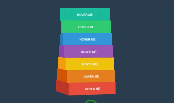
text-decoration underlineآموزش ساخت منو با CSS و HTML : منوی 3d مکعبی رنگارنگ
 کدهای HTML:
.wrapcube
  #a.cube
    .side.front HOVER ME
    .side.left
    .side.right
    .side.back
    .side.top
    .side.bottom
  #b.cube
    .side.front HOVER ME
    .side.left
    .side.right
    .side.back
    .side.top
    .side.bottom
  #c.cube
    .side.front HOVER ME
    .side.left
    .side.right
    .side.back
    .side.top
    .side.bottom
  #d.cube
    .side.front HOVER ME
    .side.left
    .side.right
    .side.back
    .side.top
    .side.bottom
  #e.cube
    .side.front HOVER ME
    .side.left
    .side.right
    .side.back
    .side.top
    .side.bottom
  #f.cube
    .side.front HOVER ME
    .side.left
    .side.right
    .side.back
    .side.top
    .side.bottom
  #g.cube
    .side.front HOVER ME
    .side.left
    .side.right
    .side.back
    .side.top
    .side.bottom
h1 rotate menu
  br
  small by Wagner Moschini
کدهای CSS:
*{
  margin:0;
  padding:0;
}
body{
  margin-left:40%;
  color:#fff;
  background:#2c3e50;
  font-size: 12px;
  min-width: 800px;
  display: block;
  position: relative;
}
.wrapcube{
  perspective: 2000px;
  perspective-origin: center center;
  width:200px;
  height:320px;
  position:absolute;
  top:50px;
  left:50px;
}
.cube{
  width:100%;
  height:50px;
  margin:0 0 0 0;
  position:relative;
  transition:.25s all ease-out;
  transform-style: preserve-3d;
  font-family: arial, helvetica, sans-serif;
  text-align: center;
  line-height: 4.5;
}
#a{z-index:1;}
#b{z-index:2;}
#c{z-index:3;}
#d{z-index:4;}
#e{z-index:3;}
#f{z-index:2;}
#g{z-index:1;}
.cube[data-rotate='1']{
  transform: rotateY(3deg) translateZ(-00px)  translateX(0px);
}
.cube[data-rotate='2']{
  transform: rotateY(6deg) translateZ(-00px) translateX(0px);
}
.cube[data-rotate='3']{
  transform: rotateY(9deg) translateZ(-00px) translateX(0px);
}
.cube[data-rotate='4']{
  transform: rotateY(12deg) translateZ(-00px) translateX(0px);
}
.cube[data-rotate='5']{
  transform: rotateY(15deg) translateZ(-00px) translateX(0px);
}
.cube[data-rotate='6']{
  transform: rotateY(18deg) translateZ(-00px) translateX(0px);
}
.side{
  width:100%;
  height:100%;
  position:absolute;
  backface:hidden;
}
.front {
  height:50px;
  transform: rotateY(0deg) rotateX(0deg) rotateZ(0deg) translateZ(100px);
}
.left {
  height:50px;
  transform: rotateY(-90deg) rotateX(0deg) rotateZ(0deg) translateZ(100px);
}
.right {
  height:50px;
  transform: rotateY(90deg) rotateX(0deg) rotateZ(0deg) translateZ(100px);
}
.back {
  height:50px;
  transform: rotateY(-180deg) rotateX(0deg) rotateZ(0deg) translateZ(100px);
}
.top {
  height:200px;
  transform: rotateY(0deg) rotateX(90deg) rotateZ(0deg) translateZ(100px);
}
.bottom {
  height:200px;
  transform: rotateY(0deg) rotateX(-90deg) rotateZ(0deg) translateZ(-50px);
}
#a .side{ background:#16a085; }
#a .front{ background:#1abc9c; }
#b .side{ background:#27ae60; }
#b .front{ background:#2ecc71; }
#c .side{ background:#2980b9; }
#c .front{ background:#3498db; }
#d .side{ background:#8e44ad; }
#d .front{ background:#9b59b6; }
#e .side{ background:#f39c12; }
#e .front{ background:#f1c40f; }
#f .side{ background:#d35400; }
#f .front{ background:#e67e22; }
#g .side{ background:#c0392b; }
#g .front{ background:#e74c3c; }
h1{
  font-size: 8em;
  font-family: 'Lobster Two';
  font-style: italic;
  text-align: right;
  line-height: .3;
  display: table;
  position: absolute;
  top: 60px;
  right: 30px;
  text-shadow: 2px 4px rgba(0,0,0,.3);
  color: #ecf0f1;
}
h1 small{
  font-size: .2em;
}
کدهای JavaScript:
var $el = $(".cube");
var rotate = function(index){
  var index = index || 0;
  $el.each(function(e){
    $(this).attr("data-rotate",Math.abs($(this).index() - index));
  });
}
$el.hover(function(e){
  var index = $(this).index();
  rotate(index);
});
rotate(0);
ساخت منو به وسیله ی نرم افزار Easy Button and Menu Maker
یکی از روشهای آسان ساخت منو، استفاده از نرم افزار Easy Button and Menu Maker میباشد. از جمله ویژگیهای خوب این نرم افزار میتوان به پشتیبانی آن از زبان فارسی اشاره کرد. نصب این نرم افزار بسیار آسان است و پس از نصب با صفحه ی زیر رو به رو خواهید شد. 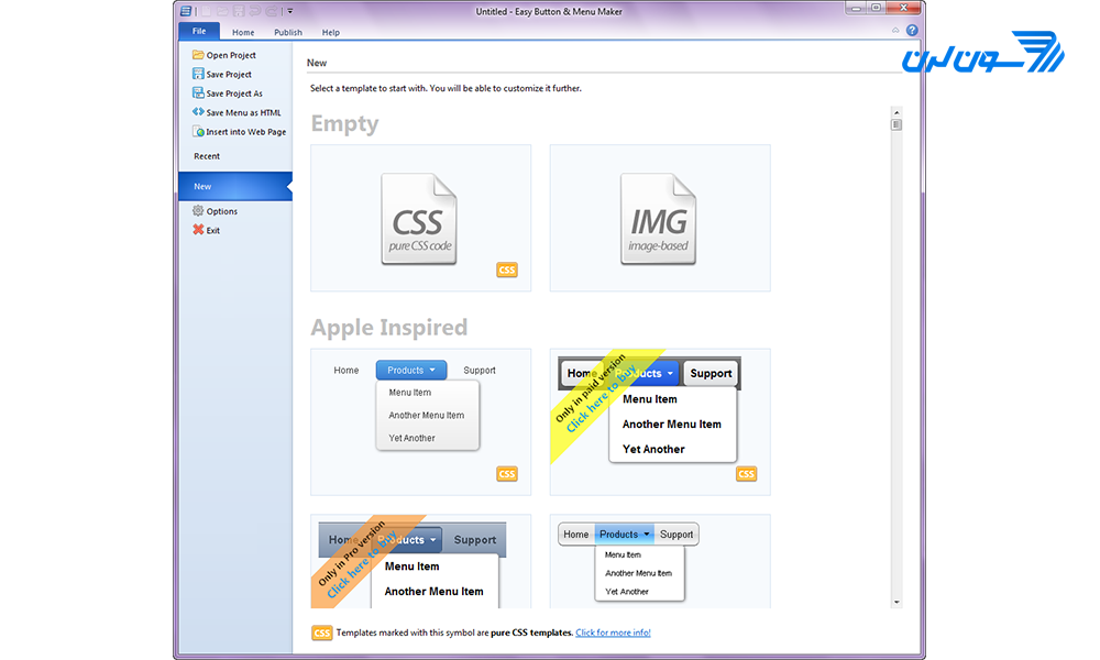 سپس میتوانید یکی از طرحهای آماده را انتخاب کرده و کار خود را شروع کنید. در این آموزش از طرح زیر استفاده شده است. در این طرح هنگام کلیک بر روی هر گزینه، آن گزینه به حالت انتخاب شده در میآید.
 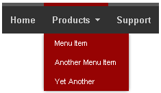 با استفاده از کادر موجود در سمت راست برنامه میتوانید تغییرات مورد نظر خود را بر روی منو اعمال کنید. برای مثال میتوانید نام، فونت، رنگ پس زمینه و رنگ هاور مورد نظر خود را انتخاب کنید.
 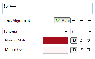 در گزینه ی بعد میتوانید Link (آدرس مقصد، هنگامی که بر روی دکمه کلیک میشود) و Hint (متنی که هنگام هاور موس بر روی دکمه نمایش داده میشود) مورد نظر خود را انتخاب کنید.
 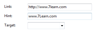 سپس میتوانید آیکون مورد نظر خود را برای دکمه انتخاب کنید.
 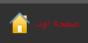 در منوی Style میتوانید تنظیمات ظاهری بیشتری را بر روی روی دکمه اعمال کنید. برای مثال میتوانید برای رنگ پس زمینه از یک طرح گرادینت استفاده کنید.
  گزینههای موجود در نوار بالای نرم افزار به شما امکان افزودن یک آیتم جدید، Copy ،Past، Redo و Undo کردن تغییرات را میدهند.
 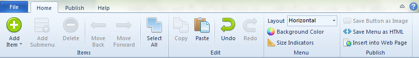 در پایان میتوانید تغییرات را Save کنید.
ایجاد انواع منوها و باکسهای تب دار در چند گام ساده!
در برخی سایتها منوهایی وجود دارند که در قسمت بالای آنها چندین تب وجود دارد و با کلیک بر روی هر تب، محتوای باکس تغییر میکند. این نوع منوها در وب اپلیکیشنها به وفور استفاده میشوند. در ادامه چند نمونه از این منوها که به Tabbed Navigation معروف هستند را به شما نشان میدهیم.
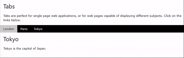
مثال 1: Tabbed Navigation
 کد:
کد:
<!DOCTYPE html>
<html>
<title>W3.CSS</title>
<meta name="viewport" content="width=device-width, initial-scale=1">
<link rel="stylesheet" href="https://www.w3schools.com/w3css/4/w3.css">
<body>
<div class="w3-container">
  <h2>Tabs</h2>
  <p>Tabs are perfect for single page web applications, or for web pages capable of displaying different subjects. Click on the links below.</p>
</div>
<div class="w3-bar w3-black">
  <button class="w3-bar-item w3-button" onclick="openCity('London')">London</button>
  <button class="w3-bar-item w3-button" onclick="openCity('Paris')">Paris</button>
  <button class="w3-bar-item w3-button" onclick="openCity('Tokyo')">Tokyo</button>
</div>
<div id="London" class="w3-container city">
  <h2>London</h2>
  <p>London is the capital city of England.</p>
</div>
<div id="Paris" class="w3-container city" style="display:none">
  <h2>Paris</h2>
  <p>Paris is the capital of France.</p>
</div>
<div id="Tokyo" class="w3-container city" style="display:none">
  <h2>Tokyo</h2>
  <p>Tokyo is the capital of Japan.</p>
</div>
<script>
function openCity(cityName) {
  var i;
  var x = document.getElementsByClassName("city");
  for (i = 0; i < x.length; i++) {
    x[i].style.display = "none";
  }
  document.getElementById(cityName).style.display = "block";
}
</script>
</body>
</html>
مثال 2: تب هایی با قابلیت بسته شدن
 کد:
کد:
<!DOCTYPE html>
<html>
<title>W3.CSS</title>
<meta name="viewport" content="width=device-width, initial-scale=1">
<link rel="stylesheet" href="https://www.w3schools.com/w3css/4/w3.css">
<body>
<div class="w3-container">
<h2>Closable Tabs</h2>
<p>To close a tab, add onclick="this.parentElement.style.display='none'" to an element inside the tab container.</p>
<p><strong>Tip:</strong> The w3-button class can be used to style the close button (x):</p>
</div>
<div class="w3-bar w3-black">
<button class="w3-bar-item w3-button" onclick="openCity('London')">London</button>
<button class="w3-bar-item w3-button" onclick="openCity('Paris')">Paris</button>
<button class="w3-bar-item w3-button" onclick="openCity('Tokyo')">Tokyo</button>
</div>
<div id="London" class="w3-container w3-display-container city">
<span onclick="this.parentElement.style.display='none'"
class="w3-button w3-large w3-display-topright">×</span>
<h2>London</h2>
<p>London is the capital city of England.</p>
</div>
<div id="Paris" class="w3-container w3-display-container city" style="display:none">
<span onclick="this.parentElement.style.display='none'"
class="w3-button w3-large w3-display-topright">×</span>
<h2>Paris</h2>
<p>Paris is the capital of France.</p>
</div>
<div id="Tokyo" class="w3-container w3-display-container city" style="display:none">
<span onclick="this.parentElement.style.display='none'"
class="w3-button w3-large w3-display-topright">×</span>
<h2>Tokyo</h2>
<p>Tokyo is the capital of Japan.</p>
</div>
<script>
function openCity(cityName) {
var i;
var x = document.getElementsByClassName("city");
for (i = 0; i < x.length; i++) {
x[i].style.display = "none";
}
document.getElementById(cityName).style.display = "block";
}
</script>
</body>
</html>مثال 3: تب فعلی / فعال
 کد:
کد:
<!DOCTYPE html>
<html>
<title>W3.CSS</title>
<meta name="viewport" content="width=device-width, initial-scale=1">
<link rel="stylesheet" href="https://www.w3schools.com/w3css/4/w3.css">
<body>
<div class="w3-container">
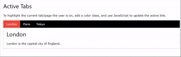
<h2>Active Tabs</h2>
<p>To highlight the current tab/page the user is on, add a color class, and use JavaScript to update the active link.</p>
<div class="w3-bar w3-black">
<button class="w3-bar-item w3-button tablink w3-red" onclick="openCity(event,'London')">London</button>
<button class="w3-bar-item w3-button tablink" onclick="openCity(event,'Paris')">Paris</button>
<button class="w3-bar-item w3-button tablink" onclick="openCity(event,'Tokyo')">Tokyo</button>
</div>
<div id="London" class="w3-container w3-border city">
<h2>London</h2>
<p>London is the capital city of England.</p>
</div>
<div id="Paris" class="w3-container w3-border city" style="display:none">
<h2>Paris</h2>
<p>Paris is the capital of France.</p>
</div>
<div id="Tokyo" class="w3-container w3-border city" style="display:none">
<h2>Tokyo</h2>
<p>Tokyo is the capital of Japan.</p>
</div>
</div>
<script>
function openCity(evt, cityName) {
var i, x, tablinks;
x = document.getElementsByClassName("city");
for (i = 0; i < x.length; i++) {
x[i].style.display = "none";
}
tablinks = document.getElementsByClassName("tablink");
for (i = 0; i < x.length; i++) {
tablinks[i].className = tablinks[i].className.replace(" w3-red", "");
}
document.getElementById(cityName).style.display = "block";
evt.currentTarget.className += " w3-red";
}
</script>
</body>
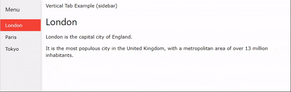
</html>مثال 4: منوی تب دار عمودی (سایدبار)
 کد:
کد:
<!DOCTYPE html>
<html>
<title>W3.CSS</title>
<meta name="viewport" content="width=device-width, initial-scale=1">
<link rel="stylesheet" href="https://www.w3schools.com/w3css/4/w3.css">
<body>
<div class="w3-sidebar w3-bar-block w3-light-grey w3-card" style="width:130px">
<h5 class="w3-bar-item">Menu</h5>
<button class="w3-bar-item w3-button tablink" onclick="openCity(event, 'London')">London</button>
<button class="w3-bar-item w3-button tablink" onclick="openCity(event, 'Paris')">Paris</button>
<button class="w3-bar-item w3-button tablink" onclick="openCity(event, 'Tokyo')">Tokyo</button>
</div>
<div style="margin-left:130px">
<div class="w3-padding">Vertical Tab Example (sidebar)</div>
<div id="London" class="w3-container city" style="display:none">
<h2>London</h2>
<p>London is the capital city of England.</p>
<p>It is the most populous city in the United Kingdom, with a metropolitan area of over 13 million inhabitants.</p>
</div>
<div id="Paris" class="w3-container city" style="display:none">
<h2>Paris</h2>
<p>Paris is the capital of France.</p>
<p>The Paris area is one of the largest population centers in Europe, with more than 12 million inhabitants.</p>
</div>
<div id="Tokyo" class="w3-container city" style="display:none">
<h2>Tokyo</h2>
<p>Tokyo is the capital of Japan.</p>
<p>It is the center of the Greater Tokyo Area, and the most populous metropolitan area in the world.</p>
</div>
</div>
<script>
function openCity(evt, cityName) {
var i, x, tablinks;
x = document.getElementsByClassName("city");
for (i = 0; i < x.length; i++) {
x[i].style.display = "none";
}
tablinks = document.getElementsByClassName("tablink");
for (i = 0; i < x.length; i++) {
tablinks[i].className = tablinks[i].className.replace(" w3-red", "");
}
document.getElementById(cityName).style.display = "block";
evt.currentTarget.className += " w3-red";
}
</script>
</body>
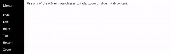
</html>مثال 5: منوی تب دار عمودی دارای انیمیشن
 کد:
کد:
<!DOCTYPE html>
<html>
<title>W3.CSS</title>
<meta name="viewport" content="width=device-width, initial-scale=1">
<link rel="stylesheet" href="https://www.w3schools.com/w3css/4/w3.css">
<body>
<div class="w3-sidebar w3-bar-block w3-black w3-card" style="width:130px">
  <h5 class="w3-bar-item">Menu</h5>
  <button class="w3-bar-item w3-button tablink" onclick="openLink(event, 'Fade')">Fade</button>
  <button class="w3-bar-item w3-button tablink" onclick="openLink(event, 'Left')">Left</button>
  <button class="w3-bar-item w3-button tablink" onclick="openLink(event, 'Right')">Right</button>
  <button class="w3-bar-item w3-button tablink" onclick="openLink(event, 'Top')">Top</button>
  <button class="w3-bar-item w3-button tablink" onclick="openLink(event, 'Bottom')">Bottom</button>
  <button class="w3-bar-item w3-button tablink" onclick="openLink(event, 'Zoom')">Zoom</button>
</div>
<div style="margin-left:130px">
  <div class="w3-padding">Use any of the w3-animate-classes to fade, zoom or slide in tab content.</div>
  <div id="Fade" class="w3-container city w3-animate-opacity" style="display:none">
    <h2>Fade in</h2>
    <p>London is the capital city of England.</p>
    <p>It is the most populous city in the United Kingdom, with a metropolitan area of over 13 million inhabitants.</p>
  </div>
  <div id="Left" class="w3-container city w3-animate-left" style="display:none">
    <h2>Slide in from left</h2>
    <p>Paris is the capital of France.</p>
    <p>The Paris area is one of the largest population centers in Europe, with more than 12 million inhabitants.</p>
  </div>
  <div id="Top" class="w3-container city w3-animate-top" style="display:none">
    <h2>Slide in from top</h2>
    <p>Tokyo is the capital of Japan.</p>
    <p>It is the center of the Greater Tokyo Area, and the most populous metropolitan area in the world.</p>
  </div>
  <div id="Right" class="w3-container city w3-animate-right" style="display:none">
    <h2>Slide in from right</h2>
    <p>London is the capital city of England.</p>
    <p>It is the most populous city in the United Kingdom, with a metropolitan area of over 13 million inhabitants.</p>
  </div>
  <div id="Bottom" class="w3-container city w3-animate-bottom" style="display:none">
    <h2>Slide in from bottom</h2>
    <p>Paris is the capital of France.</p>
    <p>The Paris area is one of the largest population centers in Europe, with more than 12 million inhabitants.</p>
  </div>
  <div id="Zoom" class="w3-container city w3-animate-zoom" style="display:none">
    <h2>Zoom in</h2>
    <p>Tokyo is the capital of Japan.</p>
    <p>It is the center of the Greater Tokyo Area, and the most populous metropolitan area in the world.</p>
  </div>
</div>
<script>
function openLink(evt, animName) {
  var i, x, tablinks;
  x = document.getElementsByClassName("city");
  for (i = 0; i < x.length; i++) {
    x[i].style.display = "none";
  }
  tablinks = document.getElementsByClassName("tablink");
  for (i = 0; i < x.length; i++) {
    tablinks[i].className = tablinks[i].className.replace(" w3-red", "");
  }
  document.getElementById(animName).style.display = "block";
  evt.currentTarget.className += " w3-red";
}
</script>
</body>
</html>
مثال 6: منوی گالری تصاویر تب دار
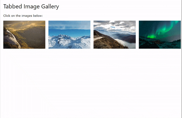 کد:
کد:
<!DOCTYPE html>
<html>
<title>W3.CSS</title>
<meta name="viewport" content="width=device-width, initial-scale=1">
<link rel="stylesheet" href="https://www.w3schools.com/w3css/4/w3.css">
<body>
<div class="w3-container">
<h2>Tabbed Image Gallery</h2>
<p>Click on the images below:</p>
</div>
<div class="w3-row-padding">
<div class="w3-col s3 w3-container">
<a href="javascript:void(0)" class="w3-hover-opacity" onclick="openImg('Nature');">
<img src="img_nature.jpg" alt="Nature" style="width:100%">
</a>
</div>
<div class="w3-col s3 w3-container">
<a href="javascript:void(0)" class="w3-hover-opacity" onclick="openImg('Snow');">
<img src="img_snowtops.jpg" alt="Snow" style="width:100%">
</a>
</div>
<div class="w3-col s3 w3-container">
<a href="javascript:void(0)" class="w3-hover-opacity" onclick="openImg('Mountains');">
<img src="img_mountains.jpg" alt="Mountains" style="width:100%">
</a>
</div>
<div class="w3-col s3 w3-container">
<a href="javascript:void(0)" class="w3-hover-opacity" onclick="openImg('Lights');">
<img src="img_lights.jpg" alt="Lights" style="width:100%">
</a>
</div>
</div><br>
<div id="Nature" class="picture w3-display-container" style="display:none">
<img src="img_nature_wide.jpg" alt="Nature" style="width:100%">
<span onclick="this.parentElement.style.display='none'"
class="w3-display-topright w3-button w3-transparent w3-text-white">×</span>
<div class="w3-display-bottomleft w3-container w3-padding w3-text-white">Nature</div>
</div>
<div id="Snow" class="picture w3-display-container" style="display:none">
<img src="img_snow_wide.jpg" alt="Snow" style="width:100%">
<span onclick="this.parentElement.style.display='none'"
class="w3-display-topright w3-button w3-transparent w3-text-white">×</span>
<div class="w3-display-bottomleft w3-container w3-padding w3-text-white">Snow</div>
</div>
<div id="Mountains" class="picture w3-display-container" style="display:none">
<img src="img_mountains_wide.jpg" alt="Mountains" style="width:100%">
<span onclick="this.parentElement.style.display='none'"
class="w3-display-topright w3-button w3-transparent">×</span>
<div class="w3-display-bottomleft w3-container w3-padding w3-text-white">Mountains</div>
</div>
<div id="Lights" class="picture w3-display-container" style="display:none">
<img src="img_lights_wide.jpg" alt="Lights" style="width:100%">
<span onclick="this.parentElement.style.display='none'"
class="w3-display-topright w3-button w3-transparent w3-text-white">×</span>
<div class="w3-display-bottomleft w3-container w3-padding w3-text-white">Northern Lights</div>
</div>
<script>
function openImg(imgName) {
var i, x;
x = document.getElementsByClassName("picture");
for (i = 0; i < x.length; i++) {
x[i].style.display = "none";
}
document.getElementById(imgName).style.display = "block";
}
</script>
</body>
</html> مثال 7: تبهای منو در یک گرید
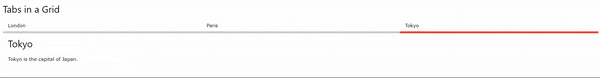 کد:
کد:
<!DOCTYPE html>
<html>
<title>W3.CSS</title>
<meta name="viewport" content="width=device-width, initial-scale=1">
<link rel="stylesheet" href="https://www.w3schools.com/w3css/4/w3.css">
<body>
<div class="w3-container">
  <h2>Tabs in a Grid</h2>
  <div class="w3-row">
    <a href="javascript:void(0)" onclick="openCity(event, 'London');">
      <div class="w3-third tablink w3-bottombar w3-hover-light-grey w3-padding">London</div>
    </a>
    <a href="javascript:void(0)" onclick="openCity(event, 'Paris');">
      <div class="w3-third tablink w3-bottombar w3-hover-light-grey w3-padding">Paris</div>
    </a>
    <a href="javascript:void(0)" onclick="openCity(event, 'Tokyo');">
      <div class="w3-third tablink w3-bottombar w3-hover-light-grey w3-padding">Tokyo</div>
    </a>
  </div>
  <div id="London" class="w3-container city" style="display:none">
    <h2>London</h2>
    <p>London is the capital city of England.</p>
  </div>
  <div id="Paris" class="w3-container city" style="display:none">
    <h2>Paris</h2>
    <p>Paris is the capital of France.</p>
  </div>
  <div id="Tokyo" class="w3-container city" style="display:none">
    <h2>Tokyo</h2>
    <p>Tokyo is the capital of Japan.</p>
  </div>
</div>
<script>
function openCity(evt, cityName) {
  var i, x, tablinks;
  x = document.getElementsByClassName("city");
  for (i = 0; i < x.length; i++) {
    x[i].style.display = "none";
  }
  tablinks = document.getElementsByClassName("tablink");
  for (i = 0; i < x.length; i++) {
    tablinks[i].className = tablinks[i].className.replace(" w3-border-red", "");
  }
  document.getElementById(cityName).style.display = "block";
  evt.currentTarget.firstElementChild.className += " w3-border-red";
}
</script>
</body>
</html>
آموزش ایجاد منوی Sticky با CSS و Javascript
پس از اسکرول کردن صفحه میتوانید افکت منوی چسبان یا استیکی را مشاهده کنید. 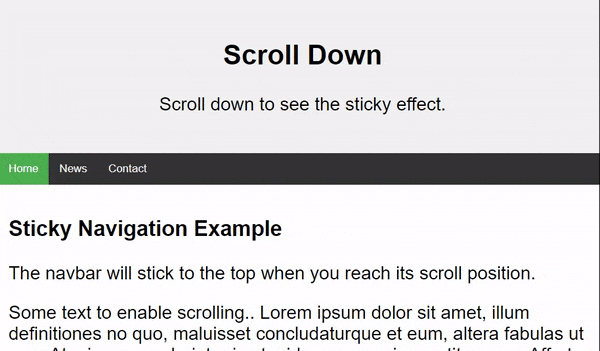 کد:
کد:
<!DOCTYPE html>
<html>
<head>
<meta name="viewport" content="width=device-width, initial-scale=1">
<style>
body {
  margin: 0;
  font-size: 28px;
  font-family: Arial, Helvetica, sans-serif;
}
.header {
  background-color: #f1f1f1;
  padding: 30px;
  text-align: center;
}
#navbar {
  overflow: hidden;
  background-color: #333;
}
#navbar a {
  float: left;
  display: block;
  color: #f2f2f2;
  text-align: center;
  padding: 14px 16px;
  text-decoration: none;
  font-size: 17px;
}
#navbar a:hover {
  background-color: #ddd;
  color: black;
}
#navbar a.active {
  background-color: #4CAF50;
  color: white;
}
.content {
  padding: 16px;
}
.sticky {
  position: fixed;
  top: 0;
  width: 100%;
}
.sticky + .content {
  padding-top: 60px;
}
</style>
</head>
<body>
<div class="header">
  <h2>Scroll Down</h2>
  <p>Scroll down to see the sticky effect.</p>
</div>
<div id="navbar">
  <a class="active" href="javascript:void(0)">Home</a>
  <a href="javascript:void(0)">News</a>
  <a href="javascript:void(0)">Contact</a>
</div>
<div class="content">
  <h3>Sticky Navigation Example</h3>
  <p>The navbar will stick to the top when you reach its scroll position.</p>
  <p>Some text to enable scrolling.. Lorem ipsum dolor sit amet, illum definitiones no quo, maluisset concludaturque et eum, altera fabulas ut quo. Atqui causae gloriatur ius te, id agam omnis evertitur eum. Affert laboramus repudiandae nec et. Inciderint efficiantur his ad. Eum no molestiae voluptatibus.</p>
  <p>Some text to enable scrolling.. Lorem ipsum dolor sit amet, illum definitiones no quo, maluisset concludaturque et eum, altera fabulas ut quo. Atqui causae gloriatur ius te, id agam omnis evertitur eum. Affert laboramus repudiandae nec et. Inciderint efficiantur his ad. Eum no molestiae voluptatibus.</p>
  <p>Some text to enable scrolling.. Lorem ipsum dolor sit amet, illum definitiones no quo, maluisset concludaturque et eum, altera fabulas ut quo. Atqui causae gloriatur ius te, id agam omnis evertitur eum. Affert laboramus repudiandae nec et. Inciderint efficiantur his ad. Eum no molestiae voluptatibus.</p>
  <p>Some text to enable scrolling.. Lorem ipsum dolor sit amet, illum definitiones no quo, maluisset concludaturque et eum, altera fabulas ut quo. Atqui causae gloriatur ius te, id agam omnis evertitur eum. Affert laboramus repudiandae nec et. Inciderint efficiantur his ad. Eum no molestiae voluptatibus.</p>
  <p>Some text to enable scrolling.. Lorem ipsum dolor sit amet, illum definitiones no quo, maluisset concludaturque et eum, altera fabulas ut quo. Atqui causae gloriatur ius te, id agam omnis evertitur eum. Affert laboramus repudiandae nec et. Inciderint efficiantur his ad. Eum no molestiae voluptatibus.</p>
  <p>Some text to enable scrolling.. Lorem ipsum dolor sit amet, illum definitiones no quo, maluisset concludaturque et eum, altera fabulas ut quo. Atqui causae gloriatur ius te, id agam omnis evertitur eum. Affert laboramus repudiandae nec et. Inciderint efficiantur his ad. Eum no molestiae voluptatibus.</p>
  <p>Some text to enable scrolling.. Lorem ipsum dolor sit amet, illum definitiones no quo, maluisset concludaturque et eum, altera fabulas ut quo. Atqui causae gloriatur ius te, id agam omnis evertitur eum. Affert laboramus repudiandae nec et. Inciderint efficiantur his ad. Eum no molestiae voluptatibus.</p>
</div>
<script>
window.onscroll = function() {myFunction()};
var navbar = document.getElementById("navbar");
var sticky = navbar.offsetTop;
function myFunction() {
  if (window.pageYOffset >= sticky) {
    navbar.classList.add("sticky")
  } else {
    navbar.classList.remove("sticky");
  }
}
</script>
</body>
</html>
جمع بندی: در مقاله ی آموزش ساخت منو با CSS و HTML به اهمیت وجود یک منو و نکات طراحی و ویژگیهای یک منوی استاندارد و کاربرپسند برای وب سایت پرداخته شد و مواردی از منوهای مدرن را به شما معرفی کردیم که میتوانید از آنها در سایت خود استفاده کرده یا برای طراحی منوهای منحصر به فرد خود از آنها الهام بگیرید. توصیه میکنیم برای ارائه ی منوی یک وب سایت با تجربه ی کاربر ی خوب، چک لیست زیر را دنبال کنید:
- یافتن آسان منوی ناوبری در صفحه
- استفاده از هاور موس برای نمایش جزییات منو
- قابلیت کلیک روی آیتمهای منو جهت اجرا
- کوتاه و واضح بودن متن آیتمهای منو
- استفاده از تنها یک استایل منوی ناوبری
- تغییر حالت عناصر منو هنگام هاور و کلیک کردن روی آن ها
- استفاده از حداکثر 8 آیتم در منوی اصلی
- ترتیب بندی موارد منو بر اساس ترتیب اهمیت
- سازگاری استایل ناوبری و سبک کلی سایت
- تشخیص آسان منوی ناوبری توسط کاربر
همچنین برای مشاهده ی نمونههای بیشتر ساخت منو با HTML و CSSمی توانید به وب سایت codepen مراجعه کنید. امیدارویم این مقاله برای شما مفید بوده باشد. نظر شما در این باره چیست؟ آیا استفاده از منوهایی با طرحهای پیچیده ی 3بعدی ترجیح میدهید یا منوهای ساده؟ خوشحال میشویم نظرات و تجربیات خود را با ما به اشتراک بگذارید.
اگر به یادگیری بیشتر در زمینه HTML , CSS و طراحی وب علاقه مند هستی با شرکت در دوره آموزش طراحی وب ، در کمتر از یکسال به یک طراح وب همه فن حریف تبدیل میشوی که آماده ی استخدام ، دریافت پروژه و کسب درآمد هستی.


۴۱ دیدگاه
حنانه
۲۲ آذر ۱۴۰۲، ۱۷:۲۲
نازنین کریمی مقدم
۰۲ دی ۱۴۰۲، ۱۶:۵۶
۱۳ آذر ۱۴۰۱، ۱۴:۱۳
۰۸ مهر ۱۴۰۱، ۱۳:۰۵
نازنین کریمی مقدم
۰۹ مهر ۱۴۰۱، ۱۱:۰۵
۰۸ شهریور ۱۴۰۱، ۱۹:۰۶
۲۵ مرداد ۱۴۰۱، ۱۵:۳۳
نازنین کریمی مقدم
۲۶ مرداد ۱۴۰۱، ۰۴:۴۲
۲۴ فروردین ۱۴۰۱، ۱۸:۴۷
نازنین کریمی مقدم
۲۷ فروردین ۱۴۰۱، ۰۷:۵۲
۲۵ اسفند ۱۴۰۰، ۱۰:۵۲
نازنین کریمی مقدم
۲۵ اسفند ۱۴۰۰، ۱۶:۲۶
۲۸ آذر ۱۴۰۰، ۰۶:۲۳
نازنین کریمی مقدم
۲۸ آذر ۱۴۰۰، ۱۱:۳۸
۲۲ آذر ۱۴۰۰، ۲۱:۱۳
E M B
۱۰ آذر ۱۴۰۰، ۰۷:۳۵
Nazanin KarimiMoghaddam
۱۰ آذر ۱۴۰۰، ۰۸:۳۹
سعید عباسی
۲۵ آبان ۱۴۰۰، ۰۸:۰۸
مرد عنکبوتی
۰۴ آبان ۱۴۰۰، ۱۶:۵۴
نازنین کریمی مقدم
۰۵ آبان ۱۴۰۰، ۱۰:۱۷
چیز
۲۸ مهر ۱۴۰۰، ۰۲:۳۹
نازنین کریمی مقدم
۲۸ مهر ۱۴۰۰، ۱۰:۰۰
مهرداد
۰۶ مهر ۱۴۰۰، ۰۸:۴۴
نازنین کریمی مقدم
۰۷ مهر ۱۴۰۰، ۱۷:۱۸
emad
۳۰ اردیبهشت ۱۴۰۰، ۱۲:۰۲
نازنین کریمی مقدم
۳۱ اردیبهشت ۱۴۰۰، ۱۴:۲۰
مانی
۰۹ اردیبهشت ۱۴۰۰، ۱۰:۴۲
نازنین کریمی مقدم
۱۱ اردیبهشت ۱۴۰۰، ۲۲:۲۸
فرشید
۲۲ فروردین ۱۴۰۰، ۱۳:۰۳
amirahmad
۰۳ فروردین ۱۴۰۰، ۱۴:۴۱
شیوا
۲۴ دی ۱۳۹۹، ۰۸:۴۲
Parsa
۲۳ دی ۱۳۹۹، ۲۱:۰۲
امیر
۰۵ آذر ۱۳۹۹، ۰۶:۴۳
نازنین کریمی مقدم
۰۶ آذر ۱۳۹۹، ۰۷:۵۴
فریبرز
۰۷ تیر ۱۳۹۹، ۰۴:۰۳
نازنین گودرزی
۰۷ تیر ۱۳۹۹، ۱۵:۲۰
حمید بهادری
۲۶ خرداد ۱۳۹۹، ۱۶:۵۸
نازنین گودرزی
۲۶ خرداد ۱۳۹۹، ۲۱:۰۶
۰۳ بهمن ۱۴۰۰، ۰۷:۵۹
زهرا خلیلی بارور
۲۲ خرداد ۱۳۹۹، ۱۰:۰۶
نازنین گودرزی
۲۲ خرداد ۱۳۹۹، ۱۷:۰۴

دوره الفبای برنامه نویسی با هدف انتخاب زبان برنامه نویسی مناسب برای شما و پاسخگویی به سوالات متداول در شروع یادگیری موقتا رایگان شد: